Kallitype Weekend Update

Hi everyone! Jen Perena here, fresh out of the darkroom. Well, 15 hours ago I actually left the Silver Den, but it FEELS like I am fresh out of the darkroom!

I finally resumed making work this past weekend (after almost a month of not making any work!), with a goal of finishing all of my printing so I can fully concentrate on water coloring the pieces for the ‘vegetation’ half of the show. I’m not 100% sure I accomplished that because I left work drying on the rack, and it always dries down darker, but I feel good about it.

Here are a few pics (iPhone photos of the work fresh out of the wash, so please excuse the reflections…) of what I made on Saturday. I spent 5 hours in the darkroom and made 8 prints that day. This set had close to the “right” exposure times (3.5 minutes) based on the richness of the final tones, though they look a bit too dark and flat to me:

Kallitype of large aloes or some kind of agave or succulent; I love this one but it is a little too dark for hand coloring
This one definitely has the right exposure, but could benefit from a teeny bit more contrast for my liking


Kallitype of snap peas and squash blossoms – also a tad too dark for hand coloring


Kallitype of kohlrabi – pretty good, but see if you can detect the ‘invisible’ root (it was purple and came out so dark it looks barely there)

On Sunday I returned to the darkroom, but when I checked the rack, I felt that the dried-down images from Saturday were a bit dark, so I reprinted everything at 3 minutes, plus added a single drop of the dichromate contrast booster to the emulsion chemistry. After washing each one, I felt they looked closer to what I am going for in terms of slightly underexposed so I can watercolor into the grayer areas. Unfortunately I didn’t get any photos of the second set; after 6 (more) hours and 9 (more) prints I was pretty tired, and it slipped my mind.

Next week at this time I will be in Guam; I am heading there for work for 2 wks and will be back Nov 17. I will try to make at least one post during that time…but it won’t be about my work (kallitypes nor watercoloring nor actual reason I am there)….more likely tropical waterfalls and beach scenes, which I know you will all love as November gets colder and grayer! But soon, I promise a sneak peek at my watercoloring!


Kallitype Chemistry is like shifting sand beneath your feet

Ciao! Jen Perena here, just back from visiting family in the Abruzzo region of eastern Italy. On the run up to the trip I was busy juggling my full-time work and prepping at home, so didn’t manage to get into the darkroom; then I was gone for about 10 days, so there was a little gap in my posts. I have been home now for just under a week, but am not 100%….I managed to develop a double sinus infection and ear infection during my travels….so instead of getting right back into the darkroom, I’ve begun watercoloring some of the vegetable prints I made in September. Photos of my work-in-progress coming in the next post!

In the mean time I wanted to share some pics from my trip (inspiration for more kallitpyes) and also some things I have been pondering over the last weeks.

Drift wood, stack of stones and traboccho, (fisherman’s stand) at Punta Aderci, along the Adriatic ‘Trabocchi Coast’

The title of this post hints at a constant challenge I face each time I make new kallitypes.

Let’s say in a perfect world I mix up a batch of fresh developer, fresh toner and fresh fixer for each session. When the first print goes into the developer, the developer immediately begins to weaken, as it leaches some of the emulsion, turning slightly yellow. After developing and washing, the print goes into the toner, and when the selenium reacts with the silver, it also starts to weaken and begins to darken. Then the print is washed again and fixed, and though the fixer doesn’t change color, you know it is becoming weaker, because it is getting absorbed into each sheet of paper. On top of that, the darkroom vent fan is causing all of the chemicals to slowly evaporate as it suctions up fumes.

Magnolia pod, Cividale, Italy

So basically, after the very first print hits all three baths, each of them is in turn slightly weakened, slightly older, slightly aged….each time you pass a new print through the same baths, you are already at a kind of disadvantage because the chemistry is not the same as when print #1 passed through.

Church door, Punta Penna, Vasto, Italy

By the end of a 3- or 4-hour long session, the developer is usually exhausted, and though the selenium continues to be usable, it takes longer and longer to get the tone shift you see when the solution is fresh. I usually save the selenium into a plastic bottle, and some of the particulate settles to the bottom, yielding a lighter-colored selenium for the next session, but it is still aged.

Shadow of seagull on the awning above the breakfast terrace of our hotel, Venice, Italy

Next session, I mix up fresh developer again, and then I reuse the same selenium and fixer. And the next session after that, same deal, until the selenium is visibly exhausted and no longer produces the color shift I want. So next session, fresh developer again and fresh selenium, but I continue to use the same fixer for at least another batch of prints.

50th Anniversary of the Annual Barcolana Regatta, largest in the world with over 2,600 boats of all classes, Bay of Trieste, Italy

Typically: my one batch of ammonium citrate developer yields 7 prints and by the time I discard it, it is pretty dark yellow; my one batch of selenium solution yields 14 or so prints and by the time I discard it, it is pretty dark black; my one batch of fixer yields roughly 25 prints, and though it is still clear when I finish, there is much less chemistry in the tray than when I started.

Door, Casalbordino, Italy

Moral of the story: not only is each print unique because of the way I coat the paper, the amount of chemistry I use to coat, the paper I select, the exposure I use, and the age and strength of the bulbs in the UV unit, but the chemistry in each bath is always different – developer stronger or weaker, selenium fresher or closer to being exhausted, etc. In order to get a more consistent result I would have to mix fresh everything for each print, which isn’t feasible, not to mention economical or practical.

And so there you have it. A dilemma which results in a feeling of constantly chasing what I have termed the ‘perfect imperfection’. There is no chance that two prints will be exactly the same. And that is perhaps what I most love about this process, even as it is endlessly frustrating knowing you just cannot control all the variables.  Fino alla prossima volta! (Until next time….)


Kallitype Progress Report

Happy Monday everyone! Jen Perena here with a look at some of my recent work.

Over the past couple sessions, I have been focusing on making prints that feature vegetation of some sort: vegetables, flowers, herbs, cacti, grasses, etc. In this post I’ll share an image of chive flowers and another of squash blossoms.

My intention with this part of the series is to produce images that I can watercolor over. When I initially conceived of this grouping, I was visualizing slightly underexposed images that would allow me to paint the entire image without ‘losing’ too much of the color in the shadows. I selected a set of vividly-colored iPhone photos, converted them to black and white, digitally manipulated them so that they would produce ‘dense negatives’ and then began contact printing. But it is never easy.

I started by printing with the very smooth print-makers paper that I mentioned a few posts back. Process-wise, when you expose the paper, then remove the negative, you are looking for a ‘whisper’ of the image. In both cases, after 5-min exposures, I got great ‘whispers’….but upon development, most of the chemistry washed away, and by the time I got to toning, there wasn’t much left. For these, I would have needed much longer exposures….however, the resulting lighter gray-toned images should work well for the watercoloring process.

Here you can see the ‘whisper’ on the left after the print came out of the UV unit, and then the final image, dried down, on the right, looking washed out and underexposed
Same thing here with the squash blossoms image – ‘whisper’ on the left, final image on the right

I next coated some of the watercolor paper I had been using. Same 5 minute exposure times, but the watercolor paper retains the chemistry much better, so these came out looking really overexposed.

Here you can see the chive flowers looking very dark, too dark to water color over and actually too overexposed to use
And for the squash blossoms, though I think this is also too dark, I really like how it came out, and I would consider not coloring it

I haven’t decided which I like best yet, but I plan to do more printing: using the watercolor paper again I’ll print shorter exposures, and using the print-makers paper I’ll print longer exposures, and see if I can get a more happy medium of resulting images with both papers. And then hopefully it will be easier to decide which to use for the watercoloring.

Stay tuned for samples of the watercolored images….

Kallitype Behind the Scenes Part 2

Happy Monday everyone! Jen Perena here with a continued behind-the-scenes look at the kallitype process, this week focusing on the development, toning and fixing steps.

First off, full disclosure, everything I know about this process I have either learned from taking classes at the Flower City Arts Center, directly from the instructor of the Kallitype class, Jon Merritt, or from reading up on the kallitype process in books and online. So even though I have made almost 100 new prints since my residency began, nothing here reflects any big revelations….

The basic process is this:

  • Develop: 8 min*, constant tray agitation
  • Wash: 1 min, running water**
  • Tone: 1 min, constant tray agitation
  • Wash: 1 min, running water
  • Fix: 1 min, constant tray agitation
  • Wash: fill and dump tray 10 times
  • Final Wash: 20 min

*In class, for the sake of time, we only developed for 1 min. This was to  allow all the students to get a turn (class is only 3 hours!), stretch the chemistry, and, for learning purposes, 1 min was sufficient, since the image appears almost instantly in the bath. Leaving the print longer is recommended when making work you care about or that you really want to stand the test of time. I have been developing for somewhere in the 4 min to 8 min range, depending on how the image appears in the bath – for example, if I see right away that the coating is uneven or there is a problem, I develop for less time.

There are several options for developing solutions and I have experimented with 4 of them, finally settling on ammonium citrate. I buy it in powdered form, pre-measured into a one-liter plastic bottle which you simply fill with hot distilled water and shake. The ammonium citrate has a slightly cooler tone than others I have tried, and I like the way it further changes in the toner. I get about 7 prints from 1 liter of solution, and along the way, the developer slowly becomes more and more yellow.

This is how the print looks in the ammonium citrate developer – notice the reddish/yellowish tone

**After developing, you wash the print in tap water for just over a minute before toning. In class we learned to fill and dump the water tray numerous times while running the hose over the print in the tray. In preparation for my residency, I learned another trick from Jon: to add about a teaspoon of citric acid into the water bath and leave the print there for 10 seconds before washing with the hose – this alkalizes the print and prevents some of the bleaching that can happen in the fixer. No matter what though, the print still lightens up a little bit during this first washing step.

Here you can see the reddish/yellowish tone has lightened up a little in the first water bath

For toning, I am using a 1% selenium solution (10 ml selenium to 1000 ml distilled water). When the toner is fresh, you see a color shift within about 10 seconds, to an even cooler (gray to black) tone; when the toner is getting exhausted, it takes upwards of 2 minutes to see the shift. Right now I am averaging 14 prints per liter of fresh selenium, and then I have to mix more.

Here you can see how the color has shifted in the selenium toner – much cooler!

You don’t actually HAVE to tone, but it is recommended to increase the longevity of the print.

You wash again (after toning) for another minute, then fix in a bath of sodium thiosulfate. The fixer is a full minute as well. I am usually making 6-7 prints per session right now, and each liter of fix is good for approximately 25 prints, so that’s around 4 printing sessions for the 1 liter. If everything went right in the steps up to the fix, there should be minimal to no color change/bleaching at this point.

Success! No further color shift or bleaching in the fix!

And then after fixing, you wash again in a tray with running water, filling and dumping the tray 10 times (2-3 min), before finally putting the print into the tub to wash for 20 min. In class we washed for roughly 10 min at the end, but again, when you really want the work to be archival, you should wash longer.  Altogether, each print takes somewhere between 20 and 40 minutes, just for the wet side of the processing.

The image shown in the photos in this post is one of the new negatives I just made and printed for the first time this past weekend. I’m excited about working with more new negatives and getting into the darkroom to do more printing over the next two weeks, so stay tuned for updates on how the new work is coming along!

Kallitype Trial and Error

Greetings and Happy Monday to everyone!

I have been managing to get into the Darkroom to work on my kallitypes about once a week (I work a full time job out in Victor and am away on weekends a lot sailing during the summer months), and slowly I am troubleshooting my errors and building up my skills. For this post, I thought I would share a glimpse behind-the-scenes into my efforts and progress.

Over the past few Tuesday nights I have made a total of 18 prints; most of them are new images, though one or two are images I have printed before but am now printing with new negatives, thanks to the help of Jon Merritt.

One of the things this process requires, if you intend to  use digital images to make large plastic negatives for printing (which I am), is skill with Photoshop so you can create enough contrast and tonal range to make an interesting image with the kallitype process. I would say I am between a beginner and an intermediate Photoshop user, so I have been consulting with Jon, who teaches the Kallitype class at the Photo Dept, for assistance with some of my trickier images.

Here is an example of an image I printed earlier this year:

Kallitype where snow detail is good but bark and debris detail are too dark

In order to get the snow-drift detail, I had to make a longer exposure, but that resulted in the details of the bark and debris becoming too dark. So, we had to isolate areas of the image and adjust the curves for each separately. The new negative results in a better, more balanced image:

Kallitype of the same image after more editing in Photoshop to produce a better negative

Another challenge I am having is that the humidity in the room and the paper I am using are resulting in lots of streaky-ness in my prints. I am using watercolor paper I have used before with a beautiful result, and ‘think’ my coating technique is the same as before….but obviously there is some room for improvement here! Here are a couple prints that really show the challenges I am having with coating smoothly:

This one shows areas where I completely missed coating

And another:

And this one shows more brush strokes / streaks

I am looking forward to getting back in the Darkroom again soon and to hopefully resolving some of my issues, and I will share more of my progress as I go!

I have also set up a new instagram account for my residency. Check it out: kallitypegirl

AIR Introduction: Jennifer Perena

Hi everyone! I am super excited to be typing this introduction as the reality of becoming a Resident Artist in the Photography & Digital Arts department at the Flower City Arts Center sinks in!

https://www.rochesterarts.org/residencies/jennifer-perena/

Many of you know me, and have known me for years. I am a Rochester native, and have been a continual student here in the photography department since 2002, when I took my first class after being laid off from a job. That class, “Introduction to Black and White Photography”, taught by Mercedes Fages, was a refresher for me, as I had learned to develop film and make black and white prints in a darkroom back in high school. After graduating and going on to college, I continued shooting black and white film with my trusty Nikon F3, but never returned to the darkroom…until 2002.

Portrait of me with my Community Darkroom apron by Tin Type instructor Tammie Malarich; this was the first workshop where I fell in love with a multi-step alternative process

Since that time, not only have I taken dozens of classes, but I have volunteered and taught with the Studio 678 youth photo club (for roughly 14 years), served as a volunteer monitor for the Darkroom (for roughly 15 years), and served as a Board member (6 years) and active member of multiple Board committees (14 years). In other words, a huge part of my creative adult life has been spent here, learning, volunteering, supporting  and being inspired by the community of artists here at the Center, and I am really thrilled to have this opportunity to make work under the Artist Residency program!

Me with my Studio 678 group at their graduation ceremony, City Hall 2017
In the field making tin types with instructor Chris Schwer

These days my main focus is alternative process photography. I love making prints where each one is totally unique, even if the starting point and process is totally the same. I have dabbled in tin types, wet plate collodion, cyanotypes and palladium printing, to name a few, but my current love is kallitypes. Kallitypes are basically silver-based contact prints. In my case, I start with iPhone photos, digitally manipulate them, create plastic negatives from them, then hand-coat watercolor paper, and make prints in a light box. Because of things like humidity, age of the chemistry, paper quality, mood of the artist, etc, each print comes out different. And sometimes they don’t really come out at all, but I still love it. It is really exciting!

One of the first kallitypes that I made that actually turned out well!
Another print of the same image didn’t come out as well, so I applied watercolor to it; I like them both!

My residency will run through almost to the end of February 2019, and during that time I hope to make many new images, resulting in an exhibition in January. I spend a lot of time at the Center and hope that if you see me, you’ll stop to say hello. I look forward to seeing you around!

arrivals/departures – The End of the Beginning

Time fly when you are having fun, that is true. I am writing this post from my house, in Medellín, Colombia, after my six-week residency at the Flower City Arts Center.

I arrived two months ago with the idea of working on migration. But, what is migration after all? I could make such a long list starting, of course, with people coming from abroad looking for opportunities, following with laws and migration quotas, walls, Border Patrol, minimum wages, working conditions, et cetera. Migration is also related to transit, dreams, plans, changes, failures, and routes. That was what I looked for.

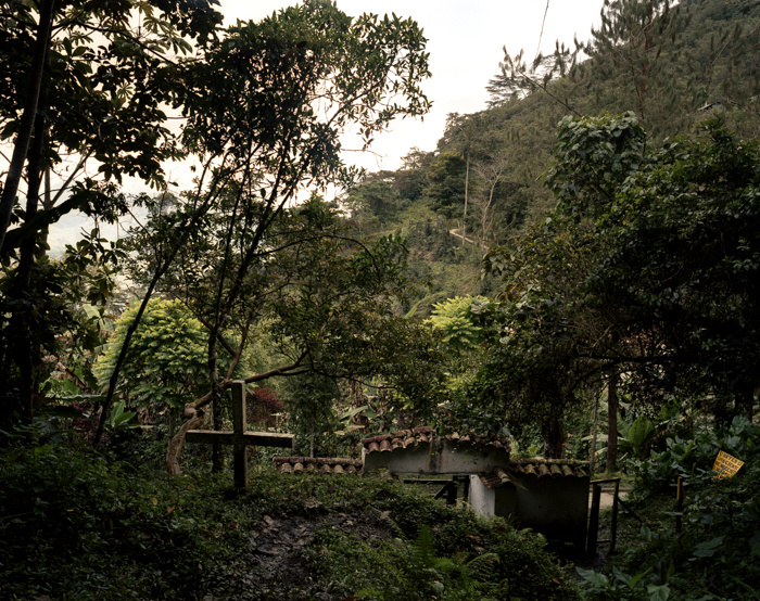
However, six weeks is such a short time… and last, but not least, in the United States, we can only find people who finished their migration path. I decided to start this project during the residency, but I will continue to work on it in the coming months, probably years. Rochester was the first stop, then I’m back in Colombia, where a lot of people wants to get out, and then I would like to go to the countries in between, probably Central America, where there is a lot of transit.

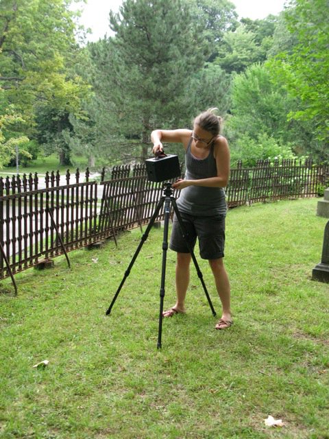
This long path is a different way of working for me. I used to make short projects instead of longer ones. For me, it was just like I had an idea, wrote some lines down, do the shots, and everything is done and gone, in six months or less. But in this case, it is going to be different. The subject matter is so wide and complex, that I would feel uncomfortable and irresponsible just doing a light or superficial approach. Showing a couple of pictures of Colombians guys surrounded by American flags or Mexican fellas in a McDonald’s restaurant. I don’t want to diss those approaches, please do not get me wrong. But the subject matter, in the actual political climate, does not allow simplifications.

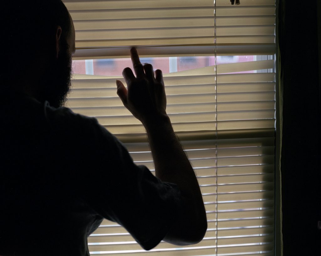
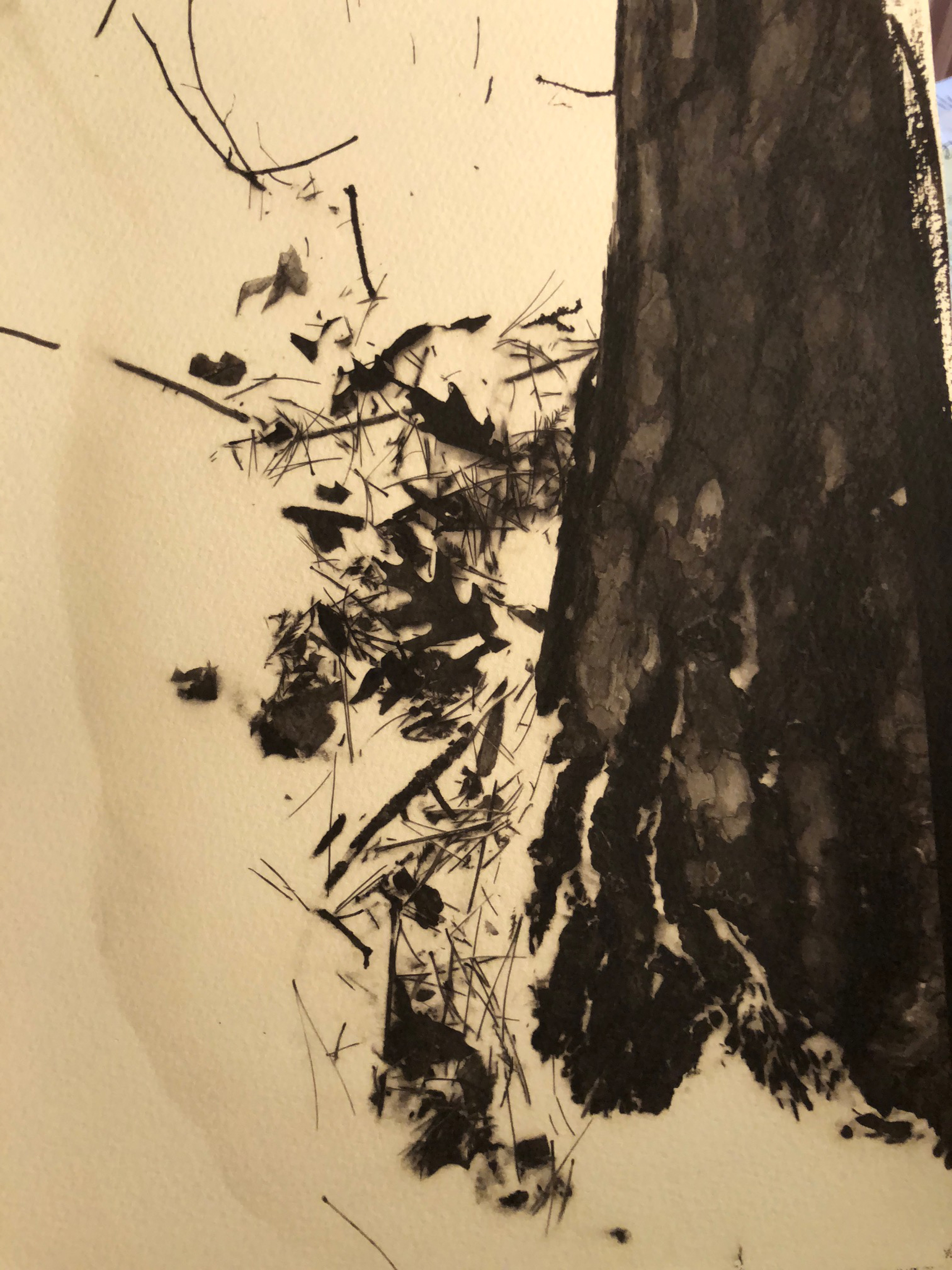
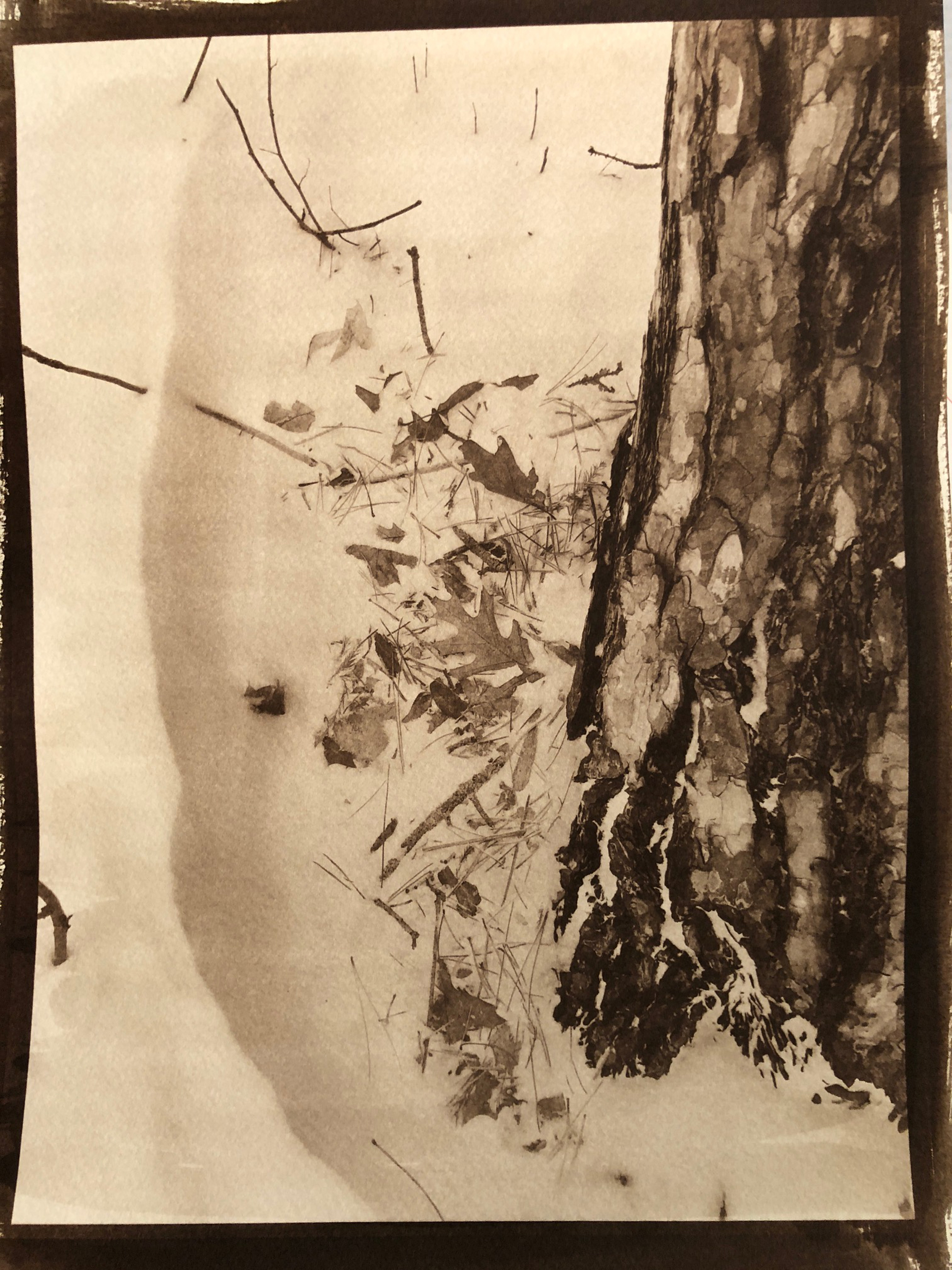
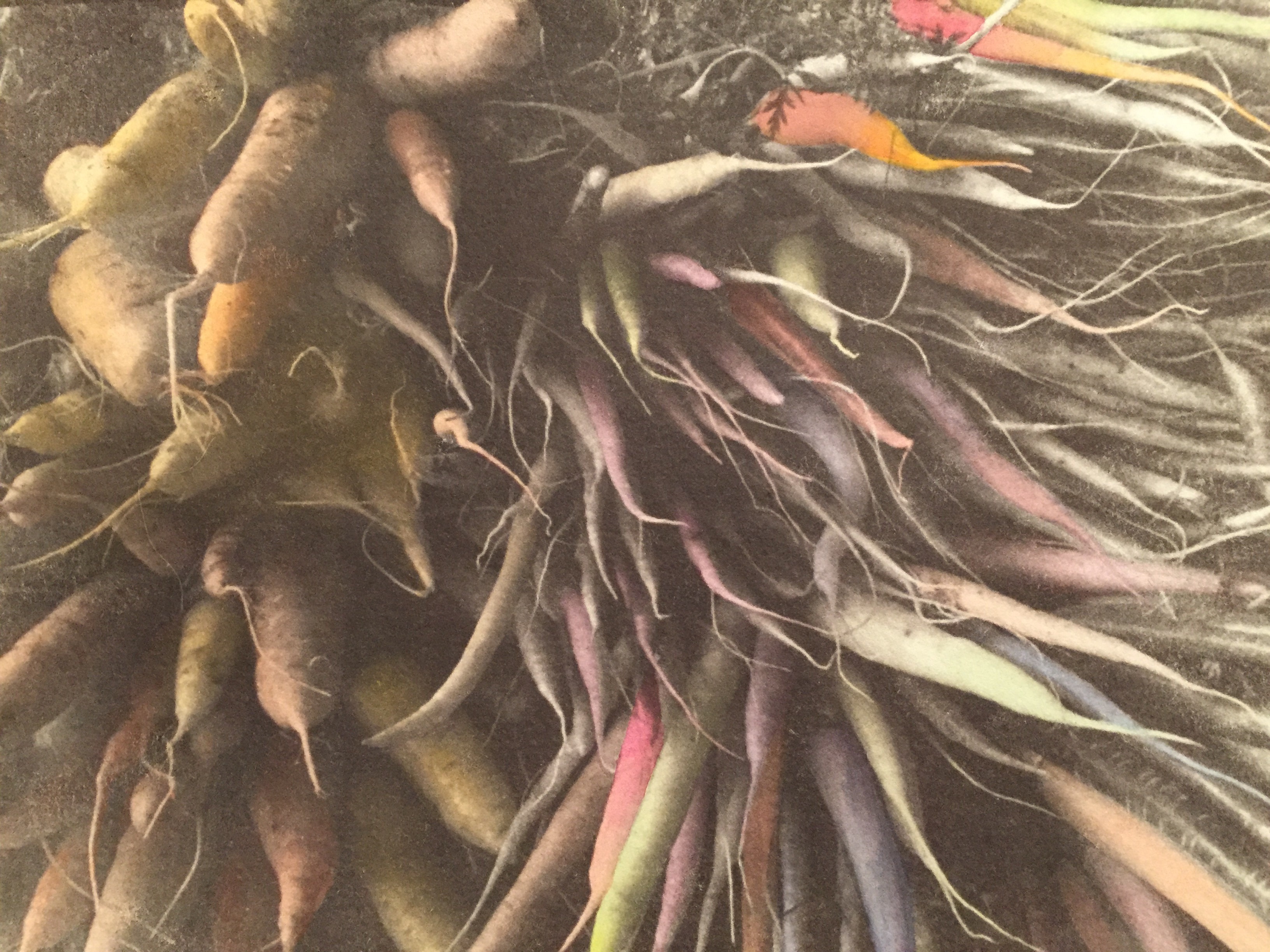
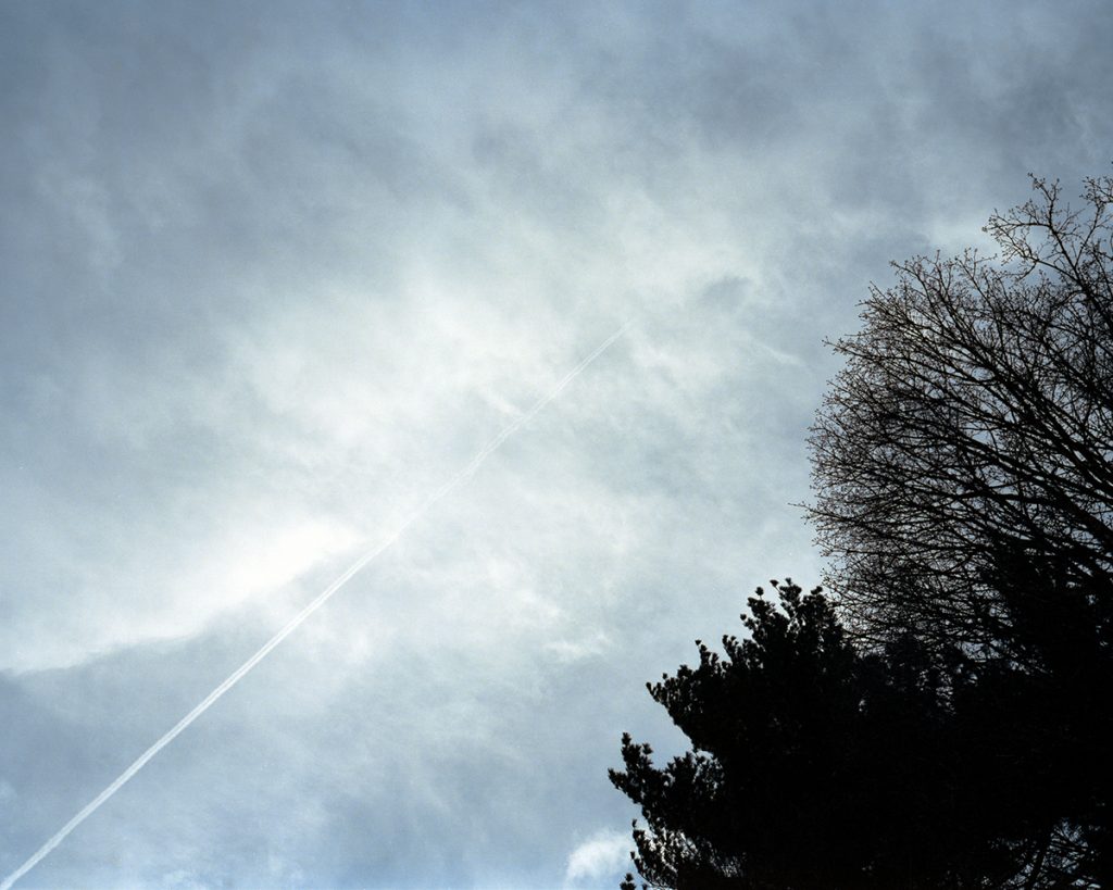
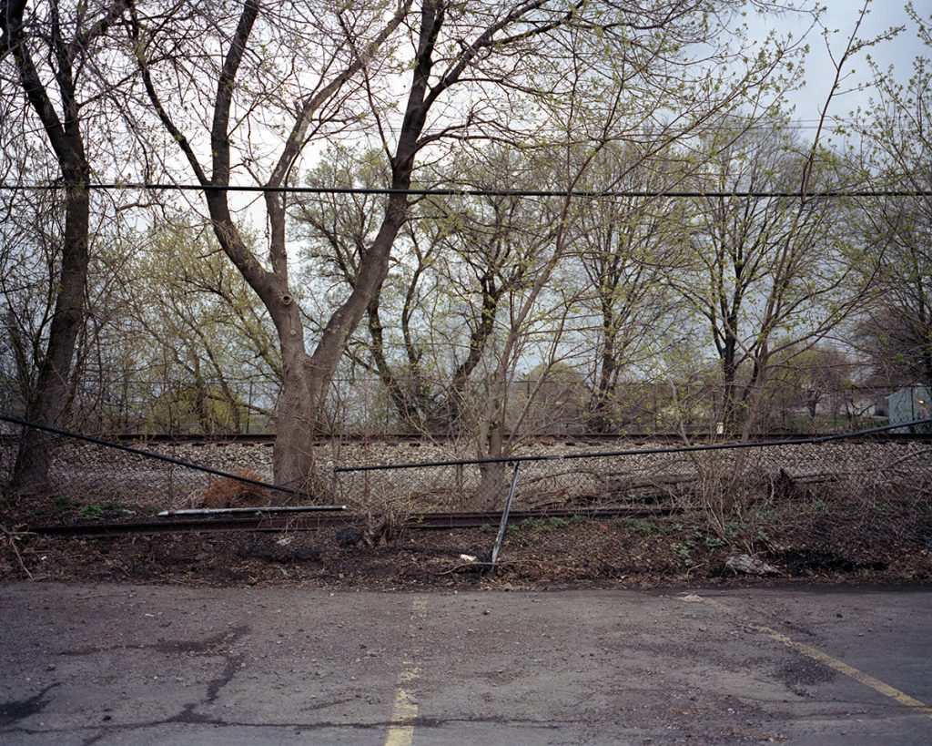
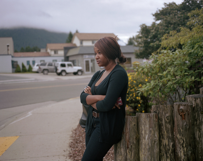
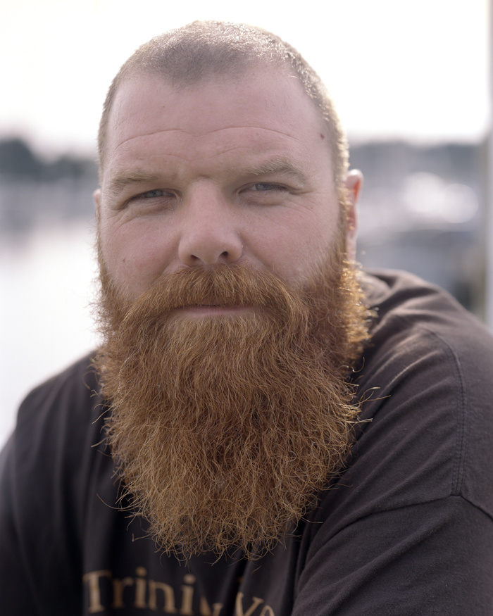
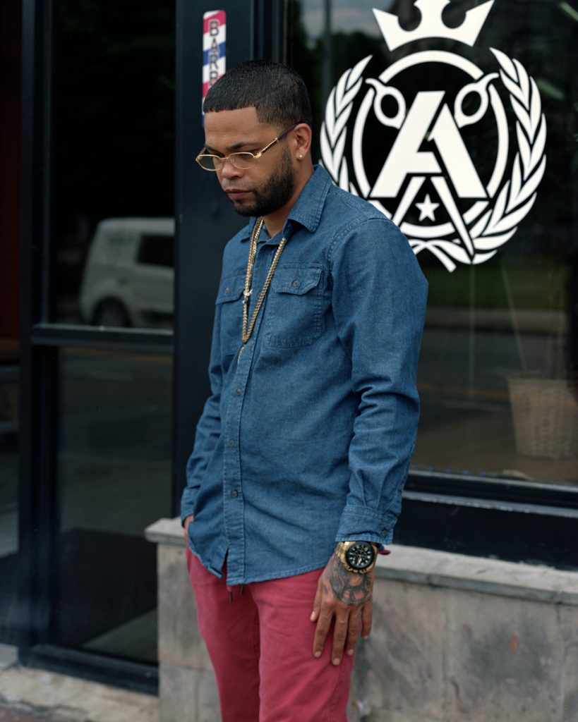
I tried to make pictures related to the idea of being and feeling a migrant. That could probably be a good start. It was not that hard because I am a migrant myself. I know how it feels to arrive at a foreign land, feel the language barriers, the fear, the uncertainty, the cultural shock. That is what I tried to show in my pictures, those are the feelings that ruled the experience. That is why there are barriers and things being in-place and out-place.

Was I successful? For me, it is to soon to answer that question… working with film, developing and scanning by myself, really slows the process down. And a deeper understanding of the situation, require time, work and commitment. I am actually happy with the results. I think I made a good selection of images, that are faithful to my initial idea. I enjoyed the process, learned a lot, and especially, got to know realities that I could not even imagine. That is the most important experience for me. My path was apparently clear, but things changed and I had to find new ways. I got moved and touched by the changes and the routes.

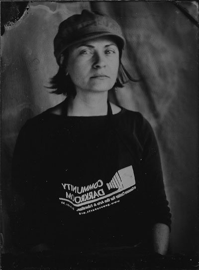
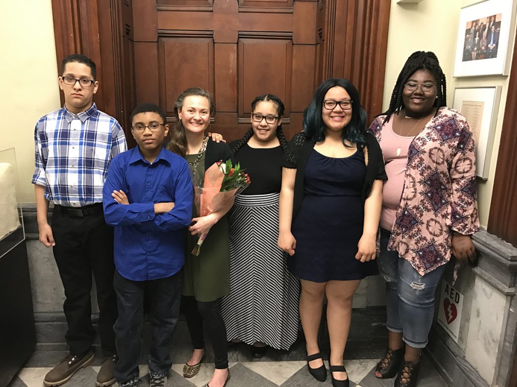
I would like to thank the Flower City Arts Center staff for their kind support over this period. Without their help, consideration, time and generosity, this would not be possible. Also thanks to Beth Peters, who generously hosted and took me around the city during this time. Thanks to the Ministry of Culture of Colombia and The Medellín Town’s Hall too, who supported this project thru a series of grants.

Finally, I would like to share some data about my journey:
Number of flights: 5
Miles by bus or train: 1400
4×5 color film sheets used: 40
120 color film rolls: 14
120 B&W film rolls: 3
35mm color film rolls (36exp.): 1
35mm B&W film rolls (36exp.): 2
Times I ate at McDonald’s: 1
Miles rode (in the bike): 390
Miles walked: 67
Cold days during my residency: all but two
Average number of coffees by day: 4
Times I get lost in Downtown Rochester: 27

Thanks for reading and see you back soon!

On Migration – A Project Update

It has been three weeks since my arrival and I want to share a brief update on my work. As I told you in my first post, this is the beginning of long-term project, that I would like to continue within my own and other countries, in order to have a wide view of the migration process and its meanings. Because of that, in the previous weeks, I have been working on finding aesthetics and approaches to the act of moving, settlement and cultural appropriation.

When talking about my project to connect with people and organizations, their first impression is that I am trying to find people from abroad. That is probably because in the United States I can only get closer to people who finish their migration path, not those who are looking to depart or trying to find new ways to their final destination. It is a partial misconception about what I am looking for because that way of understanding the subject matter will reduce my creative relationship and will only produce pictures with one meaning –i.e. a migrant worker. I would like to make work that allows me to make a creative interpretation of the topic.

As a migrant myself and because of the actual political climate in the United States, I am looking to show photographically the feelings that rule the experience. Fear, anxiety, lost, segregation, displacement, disconnection, et cetera. Working with this premises would probably take me away from the common places in the genre. But is a path that, as migration itself, does not have clear ways. It is an experience constituted by uneven rhythms, loops, waitings and moments of acceleration.

It is a new way of working for me and my practices, too. I’m feeling like challenging my own norms: I am not only using my usual 4×5 and 6×7 color film cameras, but trying with 35mm and 120 roll films in black and white. In the terms of moving, I feel myself traveling without a clear path and a predetermined end. in terms of anthropology, I am just trying to live the experience.

Want to know more and see the printed pictures? Join me for my artist talk and exhibition on June 9th, at 4PM.

AIR Introduction: Carlos Tobón Franco

Howdy! I am so glad to introduce myself to the Flower City Arts Center community. My name is Carlos, I am from Medellín, Colombia, and I will be a Photography Artist In Residence until June 9th, 2018. I get my degree as Cultural Anthropologist one year ago and I will start an MFA in Photography this fall.

I truly believe that my relationship with the world has been created thanks to photography. Pictures are my way to get into the world, the reason to interact with others and the impulse to know other places and other realities. I work in relation to documentary photography by including strongly personal narratives. I have been exploring different ways to show the idea of identity and connections between cultural statements and personal narratives.

I have moved around a lot since I was a child. I have known other cultures and realities and I believe that I am creating my own home by connecting pieces from my journeys. That is why my career has been related to movement, transit, and the constantly changing identities. I would like to start working in the residency on what would become a bigger project about migration. It is tentatively called ‘arrivals/departures’, and it is a photographic journey that aims to meet and portray those who left everything behind in the search for a better future. The transit, the waitings, and the displacements. I would like to know about paths, motifs, and desires. This ethnographic exercise of images seeks to study a variety of places, activities, and people, in order to show the complexity and the wealth of the communities. Different origins, occupations, territories, and ways of life will come together in this process.

I will be around with my 4×5 and my medium format cameras, shooting color film. I will be sharing with you the development of this work, along with my experiences. I hope to have the chance to connect and meeting you all in Rochester!

Plastic Waste

Through my documentary photography I explore the human condition and the individual paths people take on their journey. Photography for me, has been an exploration of self-discovery as I tend towards issues that have affected me personally. My hope is always to raise an awareness and open the door for conversation.

Plastic waste picked up along Hamlin Beach

Plastics: Our Human Waste has been an education unlike no other. The evolution of this project came about due to my anxiety over litter. It seemed to me that many of the issues I document have

Go Green, Braddock Heights Beach
Black Plastic, Braddock Heights Beach

no concrete solutions. Litter on the other hand seems an easy fix. Don’t litter. Recycle. Pick it up. I am now aware that it is not that easy. My approach to Plastics came about after spending a day at Hamlin Beach along the shore of Lake Ontario. Looking around I was blown away at the amount of litter washed up. This wasn’t just any old litter, it was all plastic.

Bottle caps in all colors and sizes are strewn across our parks and beaches. To be recycled, a plastic cap must be kept on the bottle otherwise it is considered a contaminant. Caps get into our waterways most often by way of littering. Littered bottle caps are washed into storm drains, making their way into bodies of water. Eventually breaking down, the plastic become false food for marine life. Photo by Daryl Thaler. #KeepTheCapAttached

Picking up this plastic as though it were sea glass, I started sorting by color, shapes, and size. Working my way through Braddock, Durand and Webster beaches picking up plastic became a daily routine. The enormous amount of multi-colored plastic waste became overwhelming.

Plastic tampon applicators are abundant along Lake Ontario beaches. Photo by Daryl Thaler. #Refuse

Researching plastic in Lake Ontario was scary:

In 2012 and 2013 NGO 5 Gyres sampled areas of Lake Ontario, they recorded levels of plastic as high as 1.1 million particles per square km. – NOW Toronto News

Alex Mifflin of NOW Toronto states, “Just like the infamous garbage patches of the Atlantic and Pacific oceans, our own backyard has been turned into a plastic soup – only our lakes have even higher concentrations of plastics than the biggest ocean garbage patches.

Plastic debris recovered by Juan Pablo Munoz’s marine biology lab at the GAIAS Institute in the Galápagos Islands. Photo by Ben McLauchlin

I raised an awareness within my own family. Thinking we have a relatively small footprint, I was so wrong, plastic is used in every facet of our lives. It is my hope that these images alongside the actual plastic collected from the shores of Lake Ontario will raise an awareness in you.

Sea life sculptures made from discarded plastic found in Binghamton, NY by Ben McLauchlin

Saturday, August 19th, I will be hosting an Artist Talk on Plastics: Our Human Waste at the Flower City Arts Center. I have several guests joining me to include photographers who participated in documenting plastic and litter Jacalyn Meyvis and Erica Jae, my husband, Daryl Thaler who ventured out with me weekly collecting plastic waste along beaches and Ben McLauchlin, a Rochester native and Binghamton University student focusing on environmental studies and graphic design. Ben has participated in research in the Galapagos Islands studying plastic and will be talking about his experiences as well as sharing his images.

While at the talk you can check out images of plastic collected along Lake Ontario beaches and litter from Rochester area parks, the actual plastic that was swimming in the lake, and some cool artwork created by local artisans from the plastic.

Mermaid created out of plastic waste found along Lake Ontario beaches, by Kelly Cheatle of Airigami Balloon Creations

Remember: Reduce. Recycle. Reuse. Refuse.