Photo Club Newsletter 2019-2020

Photo by Ni’Yana
Photo of Gabrieliz by Joel
Photo of Ni’Yana by Josiah

Hello everyone, Photo Club has made some exciting changes this year. We have expanded! Flower City Arts Center now proudly serve up to 45 students in 6th, 7th, 8th, and 9th grades from Wilson Foundation Academy and James Monroe High School.

The six goals of Photo Club are to:

  • empower youth to express their voice and vision
  • establish one to three year mentoring relationships
  • encourage youth to connect with their community
  • enhance knowledge of core school subjects
  • enable youth to build life skills
  • energize youth to work together in groups

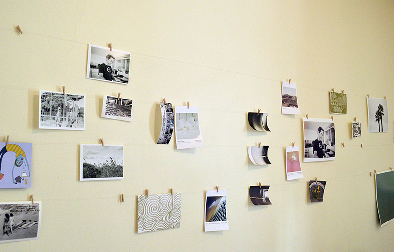
Here’s some background and a sneak preview of  student work.

Photo Club started in the spring of 1999 and is now in its twenty-second consecutive year. Conducted by Flower City Arts Center, Photo Club is a 24 session after-school photography and writing program. After years of development, Studio 678’s model has been expanded to include Studio 789, James Monroe High School Photo Club.

Photo by Isabela

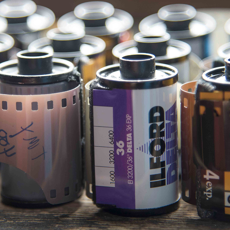
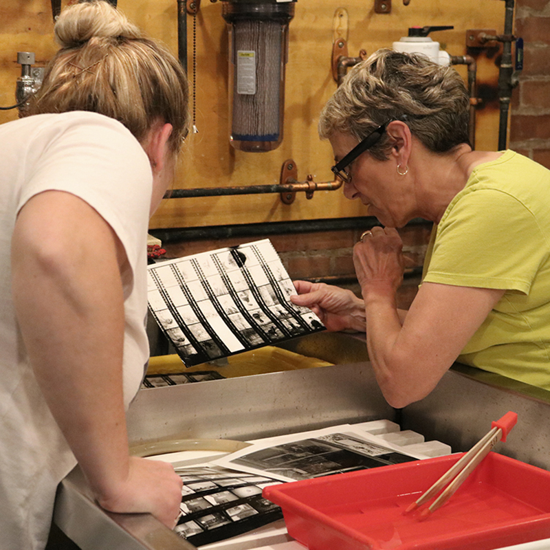
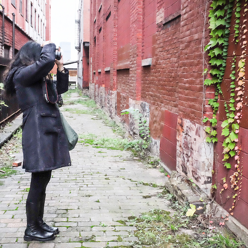
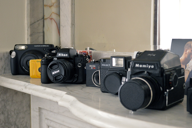
Students use a professional film camera to take pictures in the community, make their own black & white prints in the darkroom, write poems or stories to accompany their photographs, create a book of their work in the digital lab, and mat and frame their prints for exhibition.

Photo by Jadaly

The photography instructors at Flower City Arts Center work in partnership with teachers Michael Brundage and Alicia Oddo of  Wilson Foundation Academy, and Shanterra Chalice and Nilsa Irizarry of James Monroe High School.  These dedicated and caring  teachers provide an essential link from the school to our after-school program. They help recruit students, participate in every meeting, and monitor the academic performance, attendance, and individual needs of our students.

Photo by Desire

Photo Club is free to students; Flower City Arts Center secures funding for the program each year. This year’s supporters include Canfield and Tack, Cheryl & Don Olney, Daisy Marquis Jones Foundation, DiBella’s, Fay Slover Fund at The Boston Foundation,

Photo by Isabela

Feinbloom Supporting Foundation, Joy of Giving Something, Lumiere, William & Sheila Konar Foundation, Mary S. Mulligan Charitable Trust, Nancy Sands, Teresa Sipone, Vicki & Richard Schwartz Family Fund, Janet Buchanan Smith, Jeanne & Tom Verhulst, Fred & Floy Willmott Foundation, and many individuals.

Kodak Alaris donated film, Blessed Sacrament Church provided use of their parking lot, and Domino’s donated pizza. Aenon Missionary Baptist Church provided us with vans to bring students to Flower City Arts Center from school, and to various field trip sites. The Greater Rochester Community Transportation Foundation provided a grant to pay for some of the transportation costs.
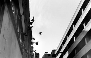
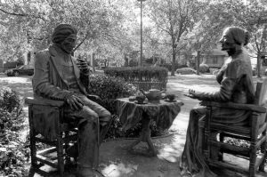
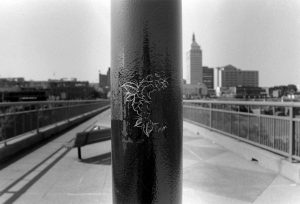
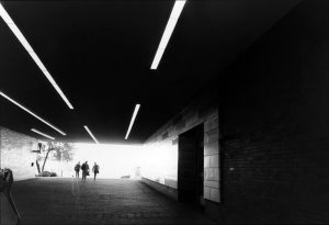
Photo of Kingston by Sahara

Look what we have been up to!

At our first meeting in September, students came to Flower City Arts Center to learn about photography by making photograms in the darkroom and learning how a 35mm film camera works.  We then assigned five students to each of the nine lead photography instructors to form groups for the year.  14 students from last year rejoined our club.

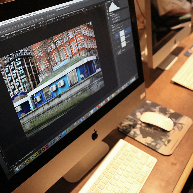
We then began rotating our time between field trips, including two Saturday trips, making black and white prints in the darkrooms at Flower City Arts Center, and learning how to scan and edit images using Photoshop.

Our field trip sites included…

Colleges – Monroe Community College, Rochester Institute of Technology and the University of Rochester.

Thermal photo of Ms. Liz’s group at RIT

Urban settings – Monroe Avenue, Neighborhood of the Arts, Martin Luther King Memorial Park, Public Market, Village Gate, High and Low Falls and Rochester Public Library.

Ms. Kylie’s group at MCC

Natural settings – Hemlock Hills Alpaca Farm, Lamberton Conservatory, Begin Again Horse Rescue, Cobbs Hill, Cracker Box Palace Animal Shelter, Sunken Gardens and Washington Grove.

Ms. Kylie group at Cracker Box Palace Animal Rescue

A variety of work places – stores on Monroe Avenue, Pet Pride of New York, Verona St Animal Society, Allie’s Pet Corner, Rochester Police Department Technicians Unit, and Rochester Fire Department Engine 1.

Ms. Juliana group visiting the Technicians Unit at RPD

Museums and historical sites – Mt. Hope Cemetery, Ganondagan State Historical Site, George Eastman Museum, Memorial Art Gallery, Rochester Museum and Science Center,   and Strong Museum of Play.

Photo by Latifa

Community events – Fringe Street Beat and other Fringe Festival events, and Hilton Apple Festival.

Photo by James

Arts and cultural locations – UUU Gallery, Performing Arts Center at MCC, Photojournalism Projects Exhibition opening at RIT’s William Harris Gallery.

Mr. Quajay’s group in the Lighting Studio

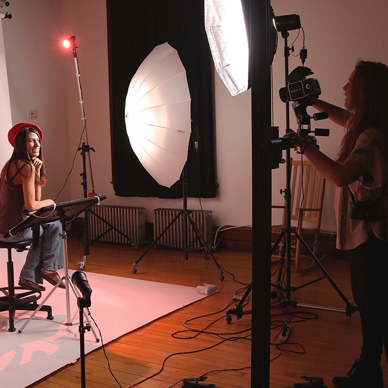
In November and December students used the photography lighting studio to take portraits of each other. From November to January, poets Doug Curry, Grace Flores, Arthur “Marvelous Marvin” McCraw, and Laura Thompson performed their own poems for inspiration and helped the students create poems to accompany their pictures.

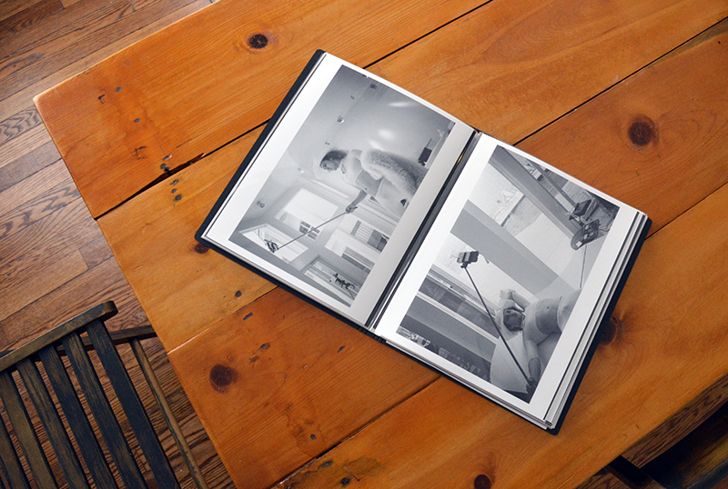
Students also learned how to scan their images  and use Photoshop in our digital lab to help create a section of book pages, with their writing and photos, and to create a multi media presentation. All the students brainstormed ideas for the book titles Wilson’s cohort chose “Through Our Eyes” and Monroe’s cohort chose “Shared Life Through the Lens”. The book cover photographs will be revealed at the ceremonies this Spring.

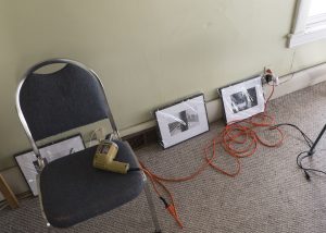
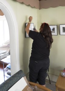
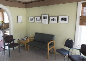
Currently, students are matting and framing  photographs for their final exhibition. Some students will make 11X14 size prints for an exhibit at Image City Photography Gallery.  In March, photos will be selected for permanent placement in a variety of community settings funded by the Fay Slover Fund at the Boston Foundation.

Studio 678 Wilson Foundation Academy Photo Club Final Ceremony

City Hall, 30 Church Street, Rochester, NY 14614,                                           Friday, March 27th, 2020

  • 6:30 pm: Awards Ceremony & Book Release in the City Council Chambers, third floor
    • Multi media Presentation of student art
    • Award Presentation with guest speaker
    • Book Release, copy awarded to each student
  • 7:30 pm: Exhibition Opening Reception in The Link Gallery, first floor
    • A selection of Studio 678 members’ photographs, writing, and special projects will be on display.

Studio 789 James Monroe High School Photo Club Final Ceremony

James Monroe High School, 164 Alexander Street, Rochester, NY 14607 Saturday, March 28th, 2020

  • 11:00 am: Awards Ceremony & Book Release in the Gymnasium
    • Multi media Presentation of student art
    • Award Presentation with guest speaker
    • Book Release, copy awarded to each student
  • 12:00 pm: Exhibition Opening Reception in the Atrium
    • A selection of Studio 789 members’ photographs, writing, and special projects will be on display.

Please support these young photographers with your presence at these uplifting events celebrating the hard work, perseverance, and creativity of our students! We hope to see you there!

UPDATE: Due to the Coronavirus Pandemic we have postponed both the Studio 678 & 789 Exhibition Openings, Awards Ceremonies, and Book Releases. We plan to hold both at Flower City Arts Center at the end of May if we are able. For the most up-to-date information please check out our Facebook page

Kallitype Chemistry is like shifting sand beneath your feet

Ciao! Jen Perena here, just back from visiting family in the Abruzzo region of eastern Italy. On the run up to the trip I was busy juggling my full-time work and prepping at home, so didn’t manage to get into the darkroom; then I was gone for about 10 days, so there was a little gap in my posts. I have been home now for just under a week, but am not 100%….I managed to develop a double sinus infection and ear infection during my travels….so instead of getting right back into the darkroom, I’ve begun watercoloring some of the vegetable prints I made in September. Photos of my work-in-progress coming in the next post!

In the mean time I wanted to share some pics from my trip (inspiration for more kallitpyes) and also some things I have been pondering over the last weeks.

Drift wood, stack of stones and traboccho, (fisherman’s stand) at Punta Aderci, along the Adriatic ‘Trabocchi Coast’

The title of this post hints at a constant challenge I face each time I make new kallitypes.

Let’s say in a perfect world I mix up a batch of fresh developer, fresh toner and fresh fixer for each session. When the first print goes into the developer, the developer immediately begins to weaken, as it leaches some of the emulsion, turning slightly yellow. After developing and washing, the print goes into the toner, and when the selenium reacts with the silver, it also starts to weaken and begins to darken. Then the print is washed again and fixed, and though the fixer doesn’t change color, you know it is becoming weaker, because it is getting absorbed into each sheet of paper. On top of that, the darkroom vent fan is causing all of the chemicals to slowly evaporate as it suctions up fumes.

Magnolia pod, Cividale, Italy

So basically, after the very first print hits all three baths, each of them is in turn slightly weakened, slightly older, slightly aged….each time you pass a new print through the same baths, you are already at a kind of disadvantage because the chemistry is not the same as when print #1 passed through.

Church door, Punta Penna, Vasto, Italy

By the end of a 3- or 4-hour long session, the developer is usually exhausted, and though the selenium continues to be usable, it takes longer and longer to get the tone shift you see when the solution is fresh. I usually save the selenium into a plastic bottle, and some of the particulate settles to the bottom, yielding a lighter-colored selenium for the next session, but it is still aged.

Shadow of seagull on the awning above the breakfast terrace of our hotel, Venice, Italy

Next session, I mix up fresh developer again, and then I reuse the same selenium and fixer. And the next session after that, same deal, until the selenium is visibly exhausted and no longer produces the color shift I want. So next session, fresh developer again and fresh selenium, but I continue to use the same fixer for at least another batch of prints.

50th Anniversary of the Annual Barcolana Regatta, largest in the world with over 2,600 boats of all classes, Bay of Trieste, Italy

Typically: my one batch of ammonium citrate developer yields 7 prints and by the time I discard it, it is pretty dark yellow; my one batch of selenium solution yields 14 or so prints and by the time I discard it, it is pretty dark black; my one batch of fixer yields roughly 25 prints, and though it is still clear when I finish, there is much less chemistry in the tray than when I started.

Door, Casalbordino, Italy

Moral of the story: not only is each print unique because of the way I coat the paper, the amount of chemistry I use to coat, the paper I select, the exposure I use, and the age and strength of the bulbs in the UV unit, but the chemistry in each bath is always different – developer stronger or weaker, selenium fresher or closer to being exhausted, etc. In order to get a more consistent result I would have to mix fresh everything for each print, which isn’t feasible, not to mention economical or practical.

And so there you have it. A dilemma which results in a feeling of constantly chasing what I have termed the ‘perfect imperfection’. There is no chance that two prints will be exactly the same. And that is perhaps what I most love about this process, even as it is endlessly frustrating knowing you just cannot control all the variables.  Fino alla prossima volta! (Until next time….)


Kallitype Progress Report

Happy Monday everyone! Jen Perena here with a look at some of my recent work.

Over the past couple sessions, I have been focusing on making prints that feature vegetation of some sort: vegetables, flowers, herbs, cacti, grasses, etc. In this post I’ll share an image of chive flowers and another of squash blossoms.

My intention with this part of the series is to produce images that I can watercolor over. When I initially conceived of this grouping, I was visualizing slightly underexposed images that would allow me to paint the entire image without ‘losing’ too much of the color in the shadows. I selected a set of vividly-colored iPhone photos, converted them to black and white, digitally manipulated them so that they would produce ‘dense negatives’ and then began contact printing. But it is never easy.

I started by printing with the very smooth print-makers paper that I mentioned a few posts back. Process-wise, when you expose the paper, then remove the negative, you are looking for a ‘whisper’ of the image. In both cases, after 5-min exposures, I got great ‘whispers’….but upon development, most of the chemistry washed away, and by the time I got to toning, there wasn’t much left. For these, I would have needed much longer exposures….however, the resulting lighter gray-toned images should work well for the watercoloring process.

Here you can see the ‘whisper’ on the left after the print came out of the UV unit, and then the final image, dried down, on the right, looking washed out and underexposed
Same thing here with the squash blossoms image – ‘whisper’ on the left, final image on the right

I next coated some of the watercolor paper I had been using. Same 5 minute exposure times, but the watercolor paper retains the chemistry much better, so these came out looking really overexposed.

Here you can see the chive flowers looking very dark, too dark to water color over and actually too overexposed to use
And for the squash blossoms, though I think this is also too dark, I really like how it came out, and I would consider not coloring it

I haven’t decided which I like best yet, but I plan to do more printing: using the watercolor paper again I’ll print shorter exposures, and using the print-makers paper I’ll print longer exposures, and see if I can get a more happy medium of resulting images with both papers. And then hopefully it will be easier to decide which to use for the watercoloring.

Stay tuned for samples of the watercolored images….

Kallitype Behind the Scenes Part 2

Happy Monday everyone! Jen Perena here with a continued behind-the-scenes look at the kallitype process, this week focusing on the development, toning and fixing steps.

First off, full disclosure, everything I know about this process I have either learned from taking classes at the Flower City Arts Center, directly from the instructor of the Kallitype class, Jon Merritt, or from reading up on the kallitype process in books and online. So even though I have made almost 100 new prints since my residency began, nothing here reflects any big revelations….

The basic process is this:

  • Develop: 8 min*, constant tray agitation
  • Wash: 1 min, running water**
  • Tone: 1 min, constant tray agitation
  • Wash: 1 min, running water
  • Fix: 1 min, constant tray agitation
  • Wash: fill and dump tray 10 times
  • Final Wash: 20 min

*In class, for the sake of time, we only developed for 1 min. This was to  allow all the students to get a turn (class is only 3 hours!), stretch the chemistry, and, for learning purposes, 1 min was sufficient, since the image appears almost instantly in the bath. Leaving the print longer is recommended when making work you care about or that you really want to stand the test of time. I have been developing for somewhere in the 4 min to 8 min range, depending on how the image appears in the bath – for example, if I see right away that the coating is uneven or there is a problem, I develop for less time.

There are several options for developing solutions and I have experimented with 4 of them, finally settling on ammonium citrate. I buy it in powdered form, pre-measured into a one-liter plastic bottle which you simply fill with hot distilled water and shake. The ammonium citrate has a slightly cooler tone than others I have tried, and I like the way it further changes in the toner. I get about 7 prints from 1 liter of solution, and along the way, the developer slowly becomes more and more yellow.

This is how the print looks in the ammonium citrate developer – notice the reddish/yellowish tone

**After developing, you wash the print in tap water for just over a minute before toning. In class we learned to fill and dump the water tray numerous times while running the hose over the print in the tray. In preparation for my residency, I learned another trick from Jon: to add about a teaspoon of citric acid into the water bath and leave the print there for 10 seconds before washing with the hose – this alkalizes the print and prevents some of the bleaching that can happen in the fixer. No matter what though, the print still lightens up a little bit during this first washing step.

Here you can see the reddish/yellowish tone has lightened up a little in the first water bath

For toning, I am using a 1% selenium solution (10 ml selenium to 1000 ml distilled water). When the toner is fresh, you see a color shift within about 10 seconds, to an even cooler (gray to black) tone; when the toner is getting exhausted, it takes upwards of 2 minutes to see the shift. Right now I am averaging 14 prints per liter of fresh selenium, and then I have to mix more.

Here you can see how the color has shifted in the selenium toner – much cooler!

You don’t actually HAVE to tone, but it is recommended to increase the longevity of the print.

You wash again (after toning) for another minute, then fix in a bath of sodium thiosulfate. The fixer is a full minute as well. I am usually making 6-7 prints per session right now, and each liter of fix is good for approximately 25 prints, so that’s around 4 printing sessions for the 1 liter. If everything went right in the steps up to the fix, there should be minimal to no color change/bleaching at this point.

Success! No further color shift or bleaching in the fix!

And then after fixing, you wash again in a tray with running water, filling and dumping the tray 10 times (2-3 min), before finally putting the print into the tub to wash for 20 min. In class we washed for roughly 10 min at the end, but again, when you really want the work to be archival, you should wash longer.  Altogether, each print takes somewhere between 20 and 40 minutes, just for the wet side of the processing.

The image shown in the photos in this post is one of the new negatives I just made and printed for the first time this past weekend. I’m excited about working with more new negatives and getting into the darkroom to do more printing over the next two weeks, so stay tuned for updates on how the new work is coming along!

Community Art Connect: Teen Empowerment


With the help of The Fay Slover Fund at The Boston Foundation 2018 is the second year that Studio 678 has been able to produce a special photography project.

Of the Community, By the Community, For the Community increases access to art in Rochester’s neighborhoods by placing student photographs for permanent exhibition in various community locations. One such location Teen Empowerment!

Here’s a behind the scenes look at the artwork going up.


Special thanks to the following students’ who worked hard to create the beautiful photographs now on display at Teen Empowerment.

Michael Failing

Miguel Sanchez

Michael Peterkin Jr.

Mohamed Hussein

Zoria Hughes


Get to Know Your Instructor: Jon Merritt

Jonathan Merritt (Jon) is an instructor here in the Photography and Digital Arts Department. He mainly teaches darkroom classes such as Intermediate Black and White Photography, Cyanotype, and Kallitype.

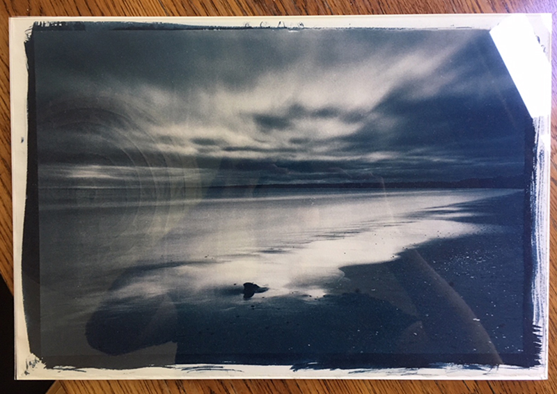
Tannic Cyanotype behind glass, 2016

What is your favorite subject matter to cover in your classes?

  •  For my black and white film/Darkroom courses I love teaching Split Grade printing. I think it’s a fantastic problem solver for students, encouraging them to approach their prints tonally rather than “is it too bright/is it too dark.” For my alternative process classes, I think I’m particularly a fan of toning Cyanotypes. It’s exciting seeing how far you can push the color from blue.

What would you consider to be the most important thing for students to do in order to reach their full potential in your class?

  • For all my classes I’d say it’s the determination to make one more print. Because there’s often more labor involved with wet printing process, it can seem frustrating when you’re so close to your “best” print, but there’s just one thing you still need to do to make it shine. I think this determination develops as you bond with the process, but I’m here to help too.

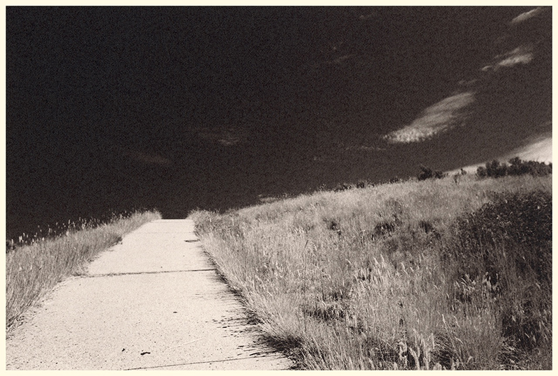
Utah, August 2017 (Silver Gelatin Print)

What is your favorite piece of equipment?

  •  Light sensitive paper! You don’t need a camera to make great work.

What is your favorite thing about Flower City Arts Center?

  • The Center has such a great vibe. Its facilities allow for privacy and for camaraderie. That’s a tough feel to pull off. Dan’s room is the best Darkroom I’ve ever used, too.

Closeup detail of a Deep Tannic Cyanotype, 2017

Do you have a catchphrase? If not, what would you make it if you had to choose one? Why?

  •  I don’t, but if I did it would probably be “walk and explore.” Corny I know, but I think one of the best things about photography is that it encourages you to explore areas you wouldn’t otherwise. Photography (hopefully) breaks the routine of job > home-and-done-for-the-day.

If you had to choose a television/ movie universe to live in, which one would it be?

  • I would love to live in a Hayao Miyazaki film. Think Spirited Away or maybe Porco Rosso. So colorful and full of mystery. I could get lost there.

Five Interesting Summer Classes

Go Retro With Film!

Learn the building blocks of photography in this introductory class.  Discover how light interacts with a camera, and take great photos while you do it. For more info & to register >>

Intermediate B&W Photography 

If you’ve already learned the basics of film, come back for more. Hone your skills in the dark room and learn new processes to take your images to the next level. For more info & to register >>

Intro DSLR Photography 

Take control of your camera! Turn off auto and learn what your camera can really do for you. For more info & to register >>

Basic Lighting Studio

In need of a professional portrait or just want to spruce up your Instagram? Then learn the basics of lighting to amp up your pictures. For more info & to register >> 

Intro To Photoshop

Now that you have all of these images, learn how to edit them like a pro in Photoshop. Learn how to navigate and use the tools in Photoshop to perfect your photos. For more info & to register >>

Interview with Louis Chavez

This week we launched our fourth online exhibition: One Year Later | Experiments in Process by Louis Chavez. I first met Louis last summer when I gave them a tour of our darkrooms. I remember being slightly taken aback when they were only interested in film processing, and not printing. Part of the magic of the darkroom is the print after all! I soon discovered that Louis made digital prints from their negative scans – the print was still an important part of their practice. Over the past several months I’ve really enjoyed watching Louis experiment in our darkrooms. Louis has also been an active member of our Darkroom Club where they’ve brought in their color film photographs. Learn more about Louis’ practice in my interview with them below.

Megan Charland: You only recently started incorporating photography into your art practice. Can you share what this medium adds to your practice and what using a camera means to you?

Louis Chavez: I’ve been into photography since I was a kid, mostly shooting with cheap toy or thrift store cameras, but it was only this year that I began to focus on learning the ins and outs of shooting with a film SLR. Using a camera allows me to represent my surroundings as authentically as I possibly can, and it has been one of the best ways for me to share these stories and bring visibility to queer and other marginalized communities.

MC: You almost exclusively are shooting film, correct? Why film photography?

LC: Film has always struck me as so much more warm and vibrant. The tones you capture when working with photo emulsion are unlike anything you see with digital, and you can alter your entire feel by choosing a different film stock. Along with photography, I have also done a good deal of screen printing, which often incorporates photo emulsion into the process of making your screen. Transferring an image to emulsion, via lens or a transparency sheet, is such a cool and interesting technique.

MC: I’m looking forward to seeing your upcoming newsprint zine you’ve been teasing – what can we expect from this project? Have you seen your zine practice shift since you started working with photography?

LC: It was never meant to be a tease so much as it’s more a matter of indecision. I find it difficult to choose which images to put in print, because that always feels so final… but making that commitment is also the point. In keeping with the tradition of analog media, I think photo work ought to be put in print, and to be shared with your audience in a tangible form. With photo zines, I tend to be more concerned with the quality of the output — from the paper type to the ink quality. For my online exhibition here, I really wanted to share a culmination of this year’s work — both online and in the form of a tabloid-sized newsprint zine.

MC: For your online exhibition here you shared different processes you’ve experimented with over the past year. What does 2018 look like for you? Are there any additional processes you are looking to experiment with, or current processes you are excited to master?

LC: I began scanning my own film this year, utilizing the facilities at the Flower City Art Center, and it has encouraged me to pick up my own scanner in order to gain a more thorough understanding of scan techniques and color correction. My goal is to have a minimal setup of bulk film, developing supplies and a scanner in order to produce images at the most inexpensive rate I can. Aside from that, I’d like to further explore documentary and editorial projects, and begin to work as a photographer on a semi-regular basis.

The Technical Pinhole Camera Project – Part 1

The technical Pinhole camera sans pinhole plate

One night Mark Watts and I were working in the darkroom together while he was making test prints for an upcoming exhibition showcasing his pinhole camera work. Prior to meeting Mark, I had been fairly disinterested and dismissive of pinhole photography which to me felt like another far-reaching “lomo” trend. I think it’s time to give pinhole cameras a second chance.

Seeing Mark’s pinhole prints in the darkroom for the first time, I was captivated by their sharpness and clarity, though not perfect in those respects but, certainly fair for artistic work. Now I’m scratching my head as those rusty pinhole knowledge gears start breaking into motion.

Meanwhile that same night Megan Charland had been coincidentally perfecting her pinhole skills in preparation for a Friday Fling in pinhole photography class. I discovered this running into her in the hall where she was inspecting a freshly developed pinhole contact print. To create her pinhole images Megan was using a handmade tubular oatmeal can as a camera; the image was fairly sharp and rich with details. Fast forward to Friday night, I jumped-in on that pinhole class to get my mitts on one of those cameras. After viewing my first pinhole picture I was impressed with the acceptable level of detail in the image – though my exposure time definitely needed an adjustment.

In these moments enters certain realizations:

  1. My artistic photography subject consists of perfectly still structures and stable tripods making shutter-speed a non-issue. In fact I want breeze swept trees and all scene motion to blur away slightly.
  2. I always shoot with a near infinite depth of field as my subjects are often expansive.
  3. I really only ever shoot with a fixed 35mm focal length for my subjects of interest.
  4. I don’t really have the “fun” money to dump into a large format field camera and lens right now, but I could get into this pinhole stuff DIY style, as I happen to also be a carpenter (though I’m not far off from building a view camera also).

One problem was that I needed the use of rise and fall camera movements which are crucial when shooting architecture. Also Mark had complained about the guesswork involved when trying to frame a composition without a viewfinder. However implementing those improvements seemed like an exciting challenge.

At this point a normal person would transcend gradually into a healthy obsession; perhaps google pinhole cameras for a while, join pinhole Flickr groups, follow pinhole culture boards on Pinterest, etc. I skipped all of that and still not knowing what a real well-made 4×5 camera even looked like. So I snagged a 4×5 film holder and my trusty micrometer, and started doing math to figure out my own design. The only thing I googled for was a useful pinhole size calculator and immediately found this site, no pictures, just all the calculators I would need.

A screen shot of the final numbers I went with for this porject
A screen shot of the final numbers I went with for this project

So, here is my challenge: build a vertical shift capable 4×5 view camera with an accurate viewfinder that compensates for raising the front standard frame shift. First step: build a cardboard proof of concept prototype.

After a week of visualizing various designs and crunching numbers I settled on building the Frankenstein pictured at the beginning of this post. Looking past that duct taped “weather sealed” exterior there’s a precision gaffer’s tape lined interior that accepts 4×5 film holders, gives me a 35mm format equivalent focal length of 28mm, and offers about 33mm of rise. I’m not worried about the viewfinder challenge just yet in this prototype, instead I’m only testing various pinhole sizes and actual shift ranges.

Stay tuned for part two where I create the actual pinhole and study some test shots.