As summer cools down and leaves begin to change, it is a great time to meditate on the beauty and uniqueness that fall brings. These three classes at Flower City are a great way to get out and experience the wonder that is Upstate New York’s autumn!
Landscape Photography: How Did We Get Where WeAre? October 1st-November 11th, Mondays 6:30 pm-8:30 pm
This class is perfect for nature lovers! The class will begin of a survey of the history of landscape photography and its evolution in the past 150 years. Students will also participate in a shooting outing and discuss their results. This is a great chance to get study other artists, get outdoors and improve your photography skills!
Click here to register for this class or to learn more!
Van Dyke Brown Workshop November 9th, 12-3 pm
This one day workshop utilizes Van Dyke Brown, a process similar to kallitype, to create warm toned prints. These brown toned prints, are perfect for capturing the spirit of fall. Participants bring their own B&W film negative, so subject matter is completely open! Images can range from 120mm to 4×5 film size. Make sure you don’t miss out on this special workshop!
Click here to register for this class or to learn more!
Boo! Photograms October 26th, 10 am-12 pm
Everyone knows, the best thing about fall is Halloween! This short class is fun for the entire family and perfect way to spend time with kids 8+. Create B&W photogram prints in the darkroom using our creepy crawly toys! These are great mementos to keep as halloween decorations for years to come!
Click here to register for this class or to learn more!
Don’t miss the chance to improve your photography skills and have fun! Click here to see all classes offered at Flower City. Hope to see you there!
Happy Monday everyone! Jen Perena here with a continued behind-the-scenes look at the kallitype process, this week focusing on the development, toning and fixing steps.
First off, full disclosure, everything I know about this process I have either learned from taking classes at the Flower City Arts Center, directly from the instructor of the Kallitype class, Jon Merritt, or from reading up on the kallitype process in books and online. So even though I have made almost 100 new prints since my residency began, nothing here reflects any big revelations….
The basic process is this:
Develop: 8 min*, constant tray agitation
Wash: 1 min, running water**
Tone: 1 min, constant tray agitation
Wash: 1 min, running water
Fix: 1 min, constant tray agitation
Wash: fill and dump tray 10 times
Final Wash: 20 min
*In class, for the sake of time, we only developed for 1 min. This was to allow all the students to get a turn (class is only 3 hours!), stretch the chemistry, and, for learning purposes, 1 min was sufficient, since the image appears almost instantly in the bath. Leaving the print longer is recommended when making work you care about or that you really want to stand the test of time. I have been developing for somewhere in the 4 min to 8 min range, depending on how the image appears in the bath – for example, if I see right away that the coating is uneven or there is a problem, I develop for less time.
There are several options for developing solutions and I have experimented with 4 of them, finally settling on ammonium citrate. I buy it in powdered form, pre-measured into a one-liter plastic bottle which you simply fill with hot distilled water and shake. The ammonium citrate has a slightly cooler tone than others I have tried, and I like the way it further changes in the toner. I get about 7 prints from 1 liter of solution, and along the way, the developer slowly becomes more and more yellow.
This is how the print looks in the ammonium citrate developer – notice the reddish/yellowish tone
**After developing, you wash the print in tap water for just over a minute before toning. In class we learned to fill and dump the water tray numerous times while running the hose over the print in the tray. In preparation for my residency, I learned another trick from Jon: to add about a teaspoon of citric acid into the water bath and leave the print there for 10 seconds before washing with the hose – this alkalizes the print and prevents some of the bleaching that can happen in the fixer. No matter what though, the print still lightens up a little bit during this first washing step.
Here you can see the reddish/yellowish tone has lightened up a little in the first water bath
For toning, I am using a 1% selenium solution (10 ml selenium to 1000 ml distilled water). When the toner is fresh, you see a color shift within about 10 seconds, to an even cooler (gray to black) tone; when the toner is getting exhausted, it takes upwards of 2 minutes to see the shift. Right now I am averaging 14 prints per liter of fresh selenium, and then I have to mix more.
Here you can see how the color has shifted in the selenium toner – much cooler!
You don’t actually HAVE to tone, but it is recommended to increase the longevity of the print.
You wash again (after toning) for another minute, then fix in a bath of sodium thiosulfate. The fixer is a full minute as well. I am usually making 6-7 prints per session right now, and each liter of fix is good for approximately 25 prints, so that’s around 4 printing sessions for the 1 liter. If everything went right in the steps up to the fix, there should be minimal to no color change/bleaching at this point.
Success! No further color shift or bleaching in the fix!
And then after fixing, you wash again in a tray with running water, filling and dumping the tray 10 times (2-3 min), before finally putting the print into the tub to wash for 20 min. In class we washed for roughly 10 min at the end, but again, when you really want the work to be archival, you should wash longer. Altogether, each print takes somewhere between 20 and 40 minutes, just for the wet side of the processing.
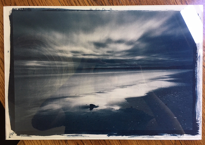
The image shown in the photos in this post is one of the new negatives I just made and printed for the first time this past weekend. I’m excited about working with more new negatives and getting into the darkroom to do more printing over the next two weeks, so stay tuned for updates on how the new work is coming along!
Happy Monday everyone! Jen Perena here with a behind-the-scenes look at the kallitype process of prepping the paper.
If you’ve read some of my other posts, you know I have been struggling a bit with getting a smooth and even coating. When the coating is uneven the resulting print shows the brushstrokes and can look streaky, patchy, and in some cases, shows spots that were completely missed. While some of the prints are still really interesting (I personally love seeing the mistakes because that image, while not perfect, is still one of a kind!), they are not what I have in mind for my exhibit, so I continue to work at it.
In this post, I wanted to share a little of how I am prepping the paper. The first step, after selecting the paper, is to mix the chemistry emulsion. I am using the standard kallitype solution: x number of drops of ferric oxalate (yellowish) and the same x number of drops of silver nitrate (clear), mixed in a shot glass (add the drops, swirl the glass), and am using this to coat the paper.
You mix a set number of drops of each chemical
I am using a paint brush that we used in class (where I learned the process), though it is not the kind of brush recommended for the process…..but so far my results are mostly good, and being a little superstitious, I am not switching (even though I did buckle down and buy new hake brushes, which are the recommended type….).
The idea is to pick up the chemistry by dipping the brush into the shot glass, then apply the chemistry, in low light, to the paper.
Hand coating the paper in dim light
You brush back and forth, criss crossing the paper in all directions, to move the chemistry around and ensure the surface is evenly coated. The light is low, so you do your best, and when the paper dries (and I should have tried to get a pic, but I forgot – sorry!), it is yellowish (from the ferric oxalate) and should show if the coating is mostly even.
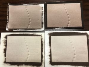
If you use less chemistry, you can coat a smaller area, and that is what gives you the brush stroke detail at the edges of the image; if you use more chemistry you can coat outside the ‘borders’ of the negative/image dimensions, and that is what gives the thick dark brown/black border showing the brushstrokes.
I am in the habit of letting the paper ‘rest’ for a few minutes before I force dry it. If you had enough time to wait for the paper to fully dry you could skip force drying the coated paper, but due to the humidity in the room, and my desire to use my time in the darkroom efficiently, I use the hair dryer, on the low setting, drying the back first, then the front, til the paper is ‘bone dry’. You test it by lightly touching it with the back of your hand. If you detect any moisture/coolness, you keep drying. (If you are in a hurry and don’t dry the paper all the way, the ink from the digital negative will stick to the paper during exposure, ruining the negative….I have personally learned this lesson…lol)
Gently dry the paper with a hair dryer
Once the paper is dry, you put it in the light box with the negative. It is a contact print, so you have to align the negative within the coated area, which, luckily, even in dim light you can see, making sure that there are no hairs or debris ‘stuck’ in the coating that could impact the print.
Then you carefully lay the negative on top of the paper in a light box
Then you expose the image for the desired number of minutes. I am doing 5-6 minutes for each one right now.
In my next post I’ll share a little about the development, toning and fixing stages!
I’ve been working hard on my coating process and experimenting with different papers, and I think I am making some progress!
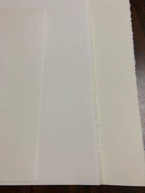
Over the Labor Day weekend, I bought some new paper in large sheets (Stonehenge print-makers paper, in two tones, cool white and warm white), cut it all up, and began making prints with it.
Cutting the large sheets down for printing – I can get four 9×11 pieces out of one sheet
I also made some prints with the Fabriano watercolor paper I had been using, but which I have been having varying success with. Here are samples of all three papers:
The three papers I am experimenting with: watercolor (left) and printmakers (middle and right) – note the color differences
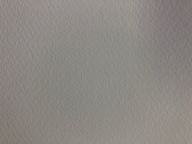
Below is a close up of the watercolor paper (cold press, 90#) that shows the ‘tooth’ or surface texture, which I really love; this paper is also great for the continued processing I plan to do where I apply watercolor over the top of the finished image:
Surface texture of Fabriano cold press 90# watercolor paper
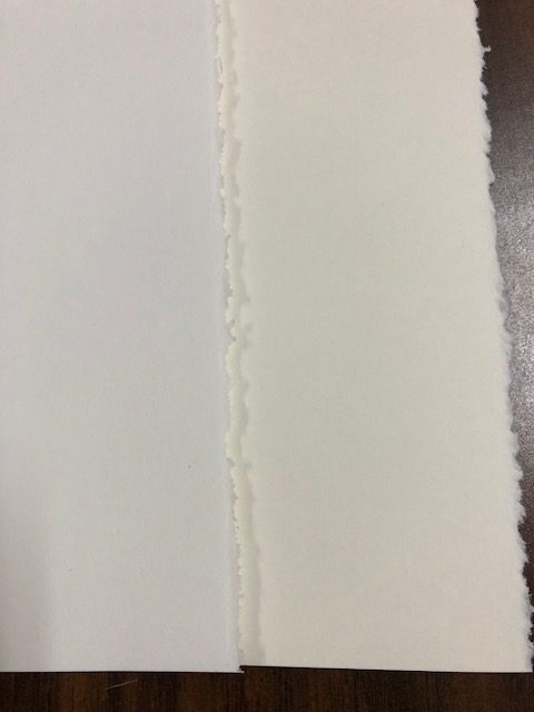
And here is a close up to really compare the color of the print maker papers. I have used Stonehenge white paper before, but had forgotten how very smooth it is. Not sure I like it, but I am making prints anyway:
This is Stonehenge white print makers paper in two tones: bright white (cool) and warm tone
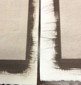
I made 4 prints of one image with the different papers for comparison. Don’t pay too much attention to the actual tonal range of the prints; I think the selenium became exhausted so the color shift I was expecting didn’t happen…but these were all 6 min exposures:
Here you can see the image with the warm tone print makers paper (left) and the cooler tone (right)And in this one you can see the top two were made with water color paper, the bottom two with print makers paper
It’s amazing how different they all came out….BUT the good news is that my coating technique was better, and the overall images show less streakiness/brush strokes in the images! I still have some work to do to make a print of this image that’s good enough for my show, but that’s why they call it a process!
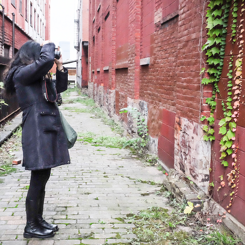
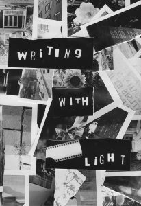
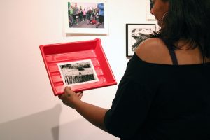
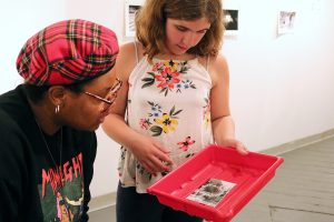
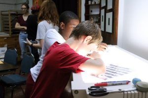
Liz here, last week Flower City Arts Center had the honor of collaborating again with Writers & Books to offer Writing with Light. This class taught students to write their own stories and poems with writer Karen van Meenen and then learn how to create their own black and white photographs with photographers Juliana Muniz, Christal Knight, and myself. The students also created a book in order to showcase their hard work!
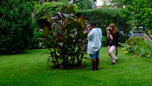
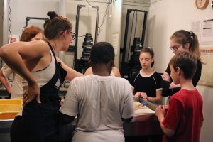
I had a blast walking around our beautiful Rochester neighborhoods, and making prints with the students. Everyone picked up the process so quickly, and no one melted in the heat. Here are some photographs of the students out shooting in Neighborhood of the Arts, and in the Community Darkrooms at Flower City Arts Center.
Special thanks to the students for their hard work, and enthusiasm! I hope everyone can comes back next year for another great week of Writing with Light.
Carina Christman
Claire Lustig
Cornelia Crumley
Eamon Capps
Evan Michaels
Kelsey Gallager
Marco Hill
Maya Taylor-Bush
Tamsin Spiller
Violet Laux
Yeshua Alba
Zion Thomas
Copies of the book are on sale for $14. Please click here if you are interested in purchasing a book.
Jonathan Merritt (Jon) is an instructor here in the Photography and Digital Arts Department. He mainly teaches darkroom classes such as Intermediate Black and White Photography, Cyanotype, and Kallitype.
Tannic Cyanotype behind glass, 2016
What is your favorite subject matter to cover in your classes?
For my black and white film/Darkroom courses I love teaching Split Grade printing. I think it’s a fantastic problem solver for students, encouraging them to approach their prints tonally rather than “is it too bright/is it too dark.” For my alternative process classes, I think I’m particularly a fan of toning Cyanotypes. It’s exciting seeing how far you can push the color from blue.
What would you consider to be the most important thing for students to do in order to reach their full potential in your class?
For all my classes I’d say it’s the determination to make one more print. Because there’s often more labor involved with wet printing process, it can seem frustrating when you’re so close to your “best” print, but there’s just one thing you still need to do to make it shine. I think this determination develops as you bond with the process, but I’m here to help too.
Utah, August 2017 (Silver Gelatin Print)
What is your favorite piece of equipment?
Light sensitive paper! You don’t need a camera to make great work.
What is your favorite thing about Flower City Arts Center?
The Center has such a great vibe. Its facilities allow for privacy and for camaraderie. That’s a tough feel to pull off. Dan’s room is the best Darkroom I’ve ever used, too.
Closeup detail of a Deep Tannic Cyanotype, 2017
Do you have a catchphrase? If not, what would you make it if you had to choose one? Why?
I don’t, but if I did it would probably be “walk and explore.” Corny I know, but I think one of the best things about photography is that it encourages you to explore areas you wouldn’t otherwise. Photography (hopefully) breaks the routine of job > home-and-done-for-the-day.
If you had to choose a television/ movie universe to live in, which one would it be?
I would love to live in a Hayao Miyazaki film. Think Spirited Away or maybe Porco Rosso. So colorful and full of mystery. I could get lost there.
Learn the building blocks of photography in this introductory class. Discover how light interacts with a camera, and take great photos while you do it. For more info & to register >>
Intermediate B&W Photography
If you’ve already learned the basics of film, come back for more. Hone your skills in the dark room and learn new processes to take your images to the next level. For more info & to register >>
Intro DSLR Photography
Take control of your camera! Turn off auto and learn what your camera can really do for you. For more info & to register >>
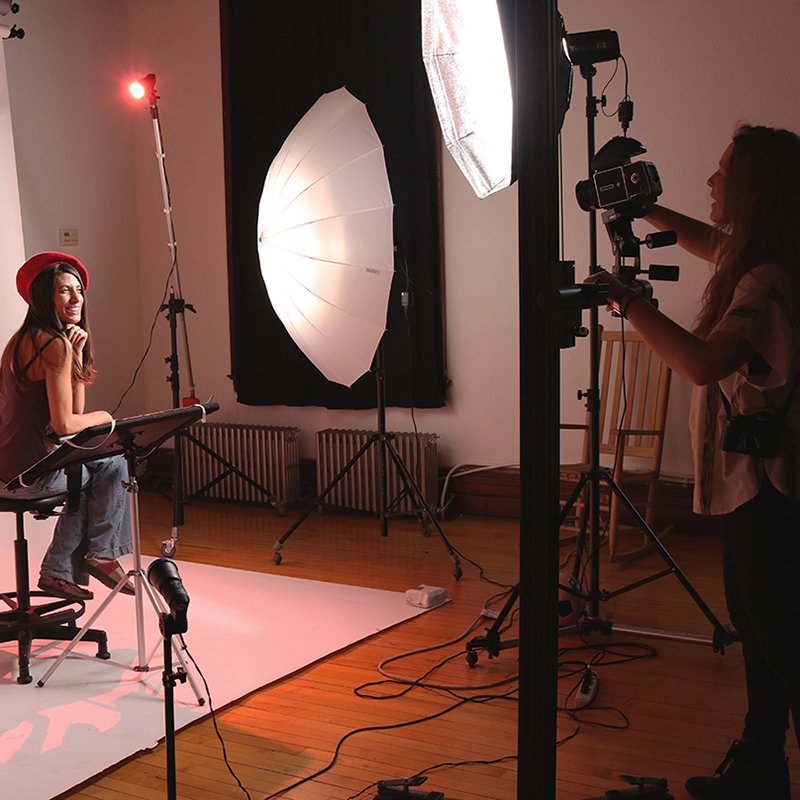
Basic Lighting Studio
In need of a professional portrait or just want to spruce up your Instagram? Then learn the basics of lighting to amp up your pictures. For more info & to register >>
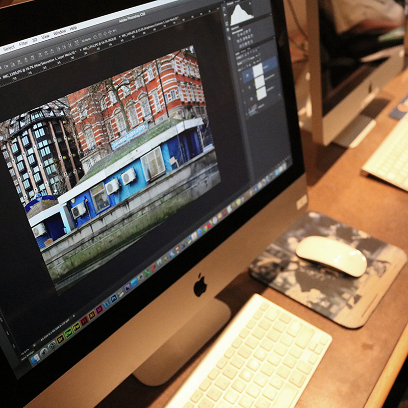
Intro To Photoshop
Now that you have all of these images, learn how to edit them like a pro in Photoshop. Learn how to navigate and use the tools in Photoshop to perfect your photos. For more info & to register >>
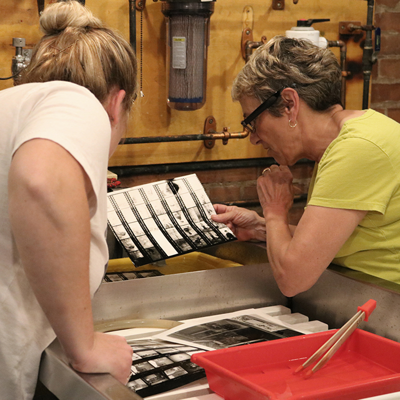
For several weeks now, I have been taking Mark Watts’ Go Retro with Film: Introduction to Photography class here at the Flower City Arts Center. I’m taking the class as I have a strong interest in working with film, however I have not worked in the darkroom in literally ages (literally). Getting back into the swing of working in the darkroom has been a real kick and has inspired some really interesting ideas for my AIR project. I don’t want to disclose too many specifics regarding the ideas, but I will be using tactics of processing and developing images in the darkroom to enhance the conceptual nature of my final show.
I want to share with you a little bit of the process we’ve been working with in the darkroom with a few images.
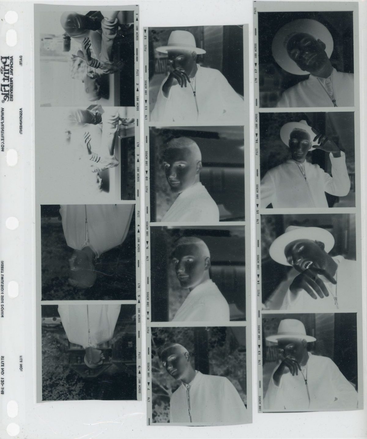
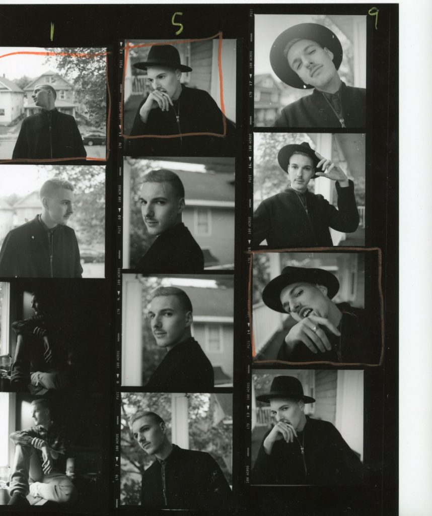
Firstly we develop the film and get images (negatives) that look like this:
From then I made a contact sheet to gauge which images I want to make full size prints of. They look like this:
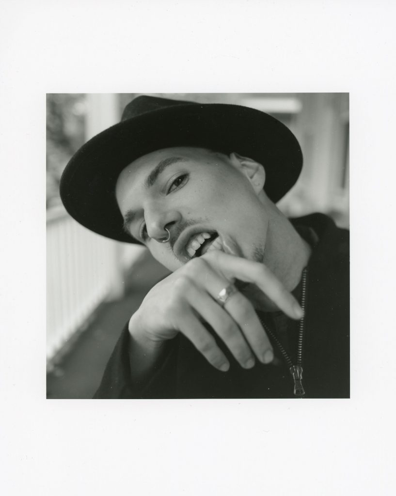
After deciding on my final image: I took several tries and made a final print of it, enlarged:
In addition to this I want to share with you some of the things I have been up to recently. I just got back from NYC, where I met photographer Benjamin Fredrickson. Benjamin is a portrait photographer living and working in NYC who’s work concentrates on portraits of members of the LGBT community. Think a contemporary Robert Mapplethorpe (yes, NSFW.)
In addition to meeting this incredible photographer, who was a huge inspiration for this project, I went to the Whitney Museum of American Art. There was an exhibit I found particularly useful called “An Incomplete History of Protest: Selections from the Whitney’s Collection, 1940–2017.” Some of the art contained therein were works created about and during the AIDS crisis. I was moved by the exhibition and found a new energy in creating work for this project.
I look forward to updating you further on the progress of the project and be sure to look out for the classes I am teaching this upcoming semester. In addition if you are interested in private lessons, please don’t hesitate to contact the arts center and request me!
One night Mark Watts and I were working in the darkroom together while he was making test prints for an upcoming exhibition showcasing his pinhole camera work. Prior to meeting Mark, I had been fairly disinterested and dismissive of pinhole photography which to me felt like another far-reaching “lomo” trend. I think it’s time to give pinhole cameras a second chance.
Seeing Mark’s pinhole prints in the darkroom for the first time, I was captivated by their sharpness and clarity, though not perfect in those respects but, certainly fair for artistic work. Now I’m scratching my head as those rusty pinhole knowledge gears start breaking into motion.
Meanwhile that same night Megan Charland had been coincidentally perfecting her pinhole skills in preparation for a Friday Fling in pinhole photography class. I discovered this running into her in the hall where she was inspecting a freshly developed pinhole contact print. To create her pinhole images Megan was using a handmade tubular oatmeal can as a camera; the image was fairly sharp and rich with details. Fast forward to Friday night, I jumped-in on that pinhole class to get my mitts on one of those cameras. After viewing my first pinhole picture I was impressed with the acceptable level of detail in the image – though my exposure time definitely needed an adjustment.
In these moments enters certain realizations:
My artistic photography subject consists of perfectly still structures and stable tripods making shutter-speed a non-issue. In fact I want breeze swept trees and all scene motion to blur away slightly.
I always shoot with a near infinite depth of field as my subjects are often expansive.
I really only ever shoot with a fixed 35mm focal length for my subjects of interest.
I don’t really have the “fun” money to dump into a large format field camera and lens right now, but I could get into this pinhole stuff DIY style, as I happen to also be a carpenter (though I’m not far off from building a view camera also).
One problem was that I needed the use of rise and fall camera movements which are crucial when shooting architecture. Also Mark had complained about the guesswork involved when trying to frame a composition without a viewfinder. However implementing those improvements seemed like an exciting challenge.
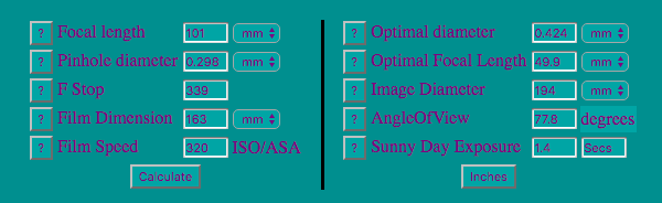
At this point a normal person would transcend gradually into a healthy obsession; perhaps google pinhole cameras for a while, join pinhole Flickr groups, follow pinhole culture boards on Pinterest, etc. I skipped all of that and still not knowing what a real well-made 4×5 camera even looked like. So I snagged a 4×5 film holder and my trusty micrometer, and started doing math to figure out my own design. The only thing I googled for was a useful pinhole size calculator and immediately found this site, no pictures, just all the calculators I would need.
A screen shot of the final numbers I went with for this project
So, here is my challenge: build a vertical shift capable 4×5 view camera with an accurate viewfinder that compensates for raising the front standard frame shift. First step: build a cardboard proof of concept prototype.
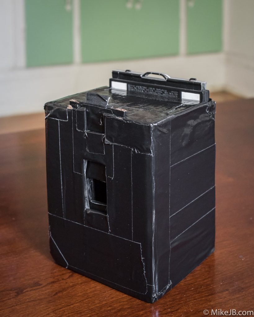
After a week of visualizing various designs and crunching numbers I settled on building the Frankenstein pictured at the beginning of this post. Looking past that duct taped “weather sealed” exterior there’s a precision gaffer’s tape lined interior that accepts 4×5 film holders, gives me a 35mm format equivalent focal length of 28mm, and offers about 33mm of rise. I’m not worried about the viewfinder challenge just yet in this prototype, instead I’m only testing various pinhole sizes and actual shift ranges.
Stay tuned for part two where I create the actual pinhole and study some test shots.
 Landscape Photography: How Did We Get Where We Are?
 Van Dyke Brown Workshop
 Boo! Photograms


 ast week

 Tannic Cyanotype behind glass, 2016
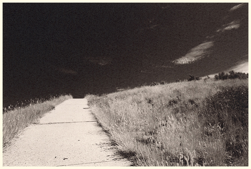 Utah, August 2017 (Silver Gelatin Print)
 Closeup detail of a Deep Tannic Cyanotype, 2017