Kallitype Progress Report

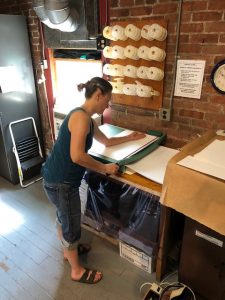
Happy Monday everyone! Jen Perena here with a look at some of my recent work.

Over the past couple sessions, I have been focusing on making prints that feature vegetation of some sort: vegetables, flowers, herbs, cacti, grasses, etc. In this post I’ll share an image of chive flowers and another of squash blossoms.

My intention with this part of the series is to produce images that I can watercolor over. When I initially conceived of this grouping, I was visualizing slightly underexposed images that would allow me to paint the entire image without ‘losing’ too much of the color in the shadows. I selected a set of vividly-colored iPhone photos, converted them to black and white, digitally manipulated them so that they would produce ‘dense negatives’ and then began contact printing. But it is never easy.

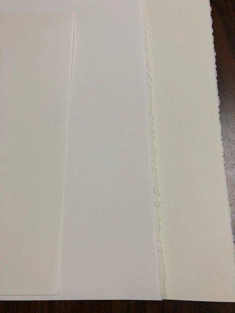
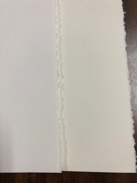
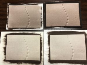
I started by printing with the very smooth print-makers paper that I mentioned a few posts back. Process-wise, when you expose the paper, then remove the negative, you are looking for a ‘whisper’ of the image. In both cases, after 5-min exposures, I got great ‘whispers’….but upon development, most of the chemistry washed away, and by the time I got to toning, there wasn’t much left. For these, I would have needed much longer exposures….however, the resulting lighter gray-toned images should work well for the watercoloring process.

Here you can see the ‘whisper’ on the left after the print came out of the UV unit, and then the final image, dried down, on the right, looking washed out and underexposed
Same thing here with the squash blossoms image – ‘whisper’ on the left, final image on the right

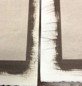
I next coated some of the watercolor paper I had been using. Same 5 minute exposure times, but the watercolor paper retains the chemistry much better, so these came out looking really overexposed.

Here you can see the chive flowers looking very dark, too dark to water color over and actually too overexposed to use
And for the squash blossoms, though I think this is also too dark, I really like how it came out, and I would consider not coloring it

I haven’t decided which I like best yet, but I plan to do more printing: using the watercolor paper again I’ll print shorter exposures, and using the print-makers paper I’ll print longer exposures, and see if I can get a more happy medium of resulting images with both papers. And then hopefully it will be easier to decide which to use for the watercoloring.

Stay tuned for samples of the watercolored images….

Kallitype Trial and Error Continued

Hi everyone, Jen Perena here!

I’ve been working hard on my coating process and experimenting with different papers, and I think I am making some progress!

Over the Labor Day weekend, I bought some new paper in large sheets (Stonehenge print-makers paper, in two tones, cool white and warm white), cut it all up, and began making prints with it.

Cutting the large sheets down for printing – I can get four 9×11 pieces out of one sheet

I also made some prints with the Fabriano watercolor paper I had been using, but which I have been having varying success with. Here are samples of all three papers:

The three papers I am experimenting with: watercolor (left) and printmakers (middle and right) – note the color differences

Below is a close up of the watercolor paper (cold press, 90#) that shows the ‘tooth’ or surface texture, which I really love; this paper is also great for the  continued processing I plan to do where I apply watercolor over the top of the finished image:

Surface texture of Fabriano cold press 90# watercolor paper

And here is a close up to really compare the color of the print maker papers. I have used Stonehenge white paper before, but had forgotten how very smooth it is. Not sure I like it, but I am making prints anyway:

This is Stonehenge white print makers paper in two tones: bright white (cool) and warm tone

I made 4 prints of one image with the different papers for comparison. Don’t pay too much attention to the actual tonal range of the prints; I think the selenium became exhausted so the color shift I was expecting didn’t happen…but these were all 6 min exposures:

Here you can see the image with the warm tone print makers paper (left) and the cooler tone (right)
And in this one you can see the top two were made with water color paper, the bottom two with print makers paper

It’s amazing how different they all came out….BUT the good news is that my coating technique was better, and the overall images show less streakiness/brush strokes in the images! I still have some work to do to make a print of this image that’s good enough for my show, but that’s why they call it a process!